Bee Bridges is a game development company creating adventure games available on Steam. Founded by a versatile team of industry veterans driven by frustration with a repetitive gaming landscape, Bee Bridges Interactive was born from a desire to break away from short-term performance logic to build a new creative space where diverse stories and perspectives are the standard.
The studio takes its name from a fascinating natural phenomenon: the “bee bridge,” where bees physically link together to form a living bridge, allowing the colony to cross a void.
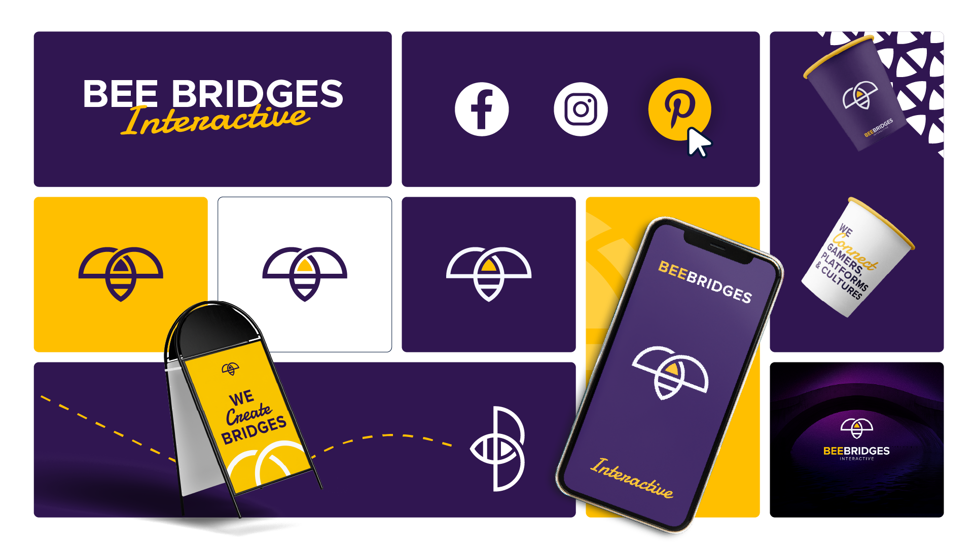
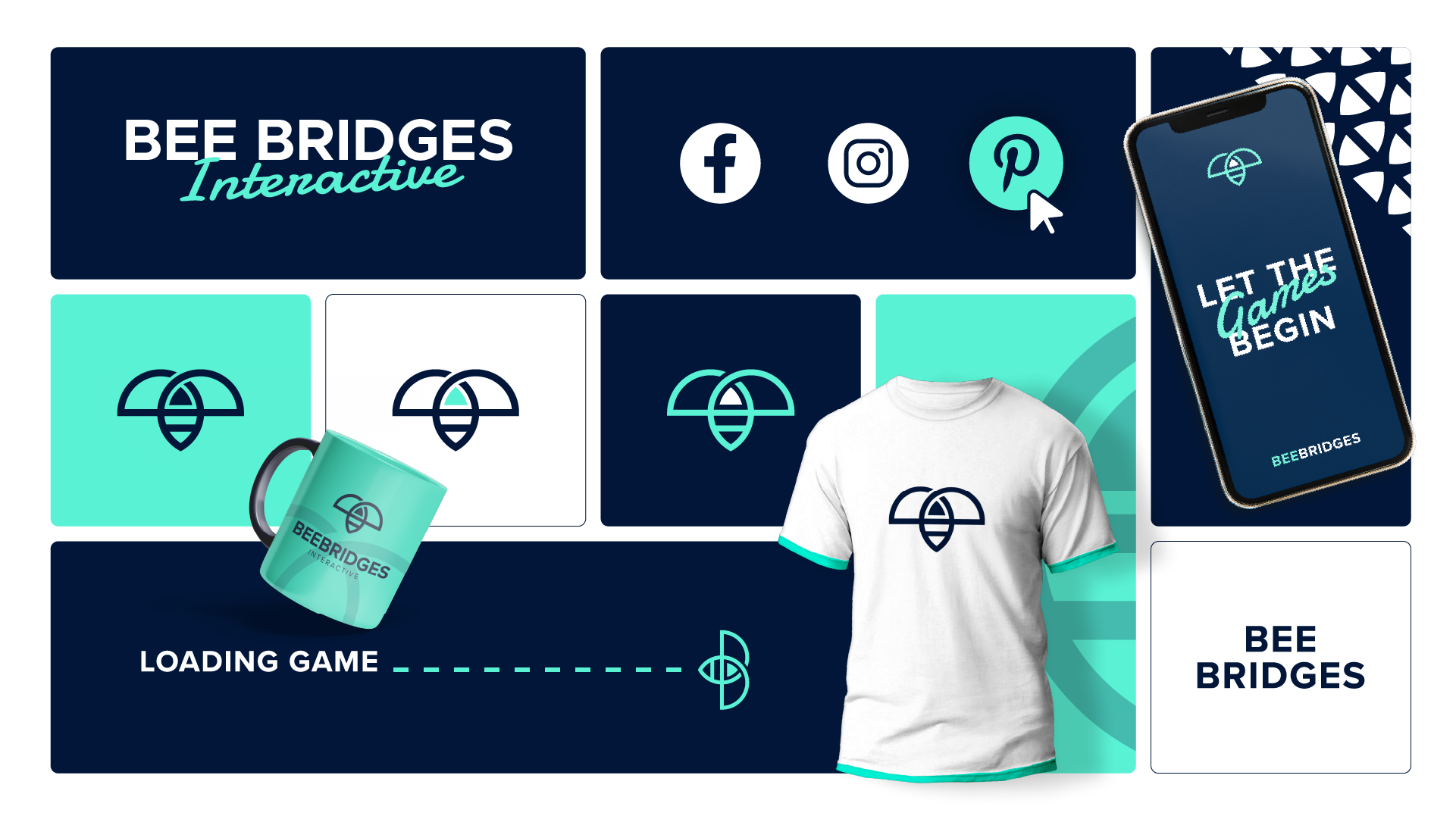
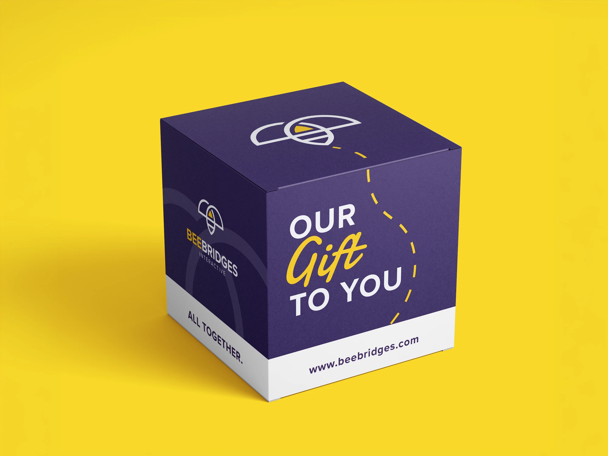
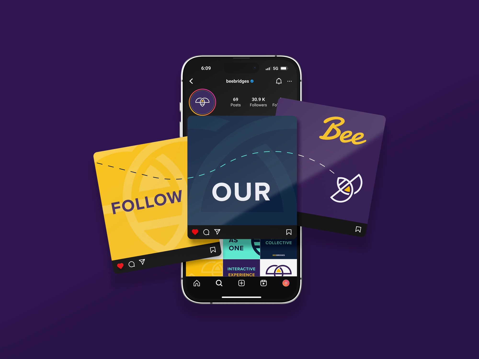
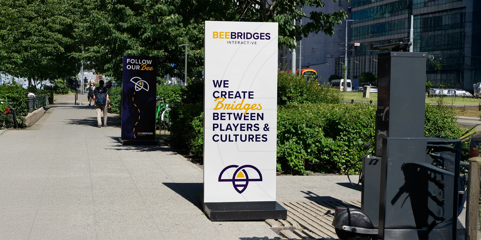
The goal of this project was to uncover what matters most to the people behind and around the brand, then translate those values into a thoughtful visual identity. From the logo and brand collateral to the final website, every element was designed to work together and create a distinctive, cohesive experience across both print and digital touchpoints.
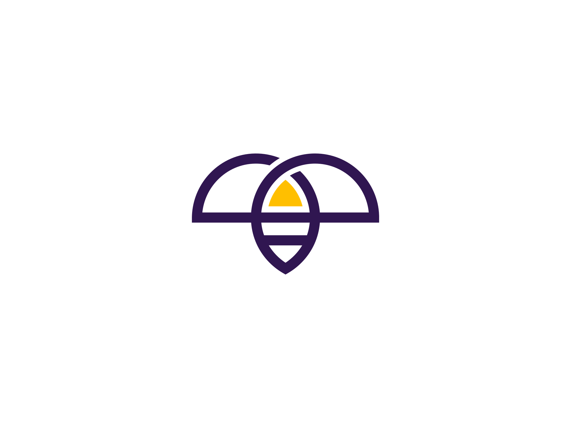
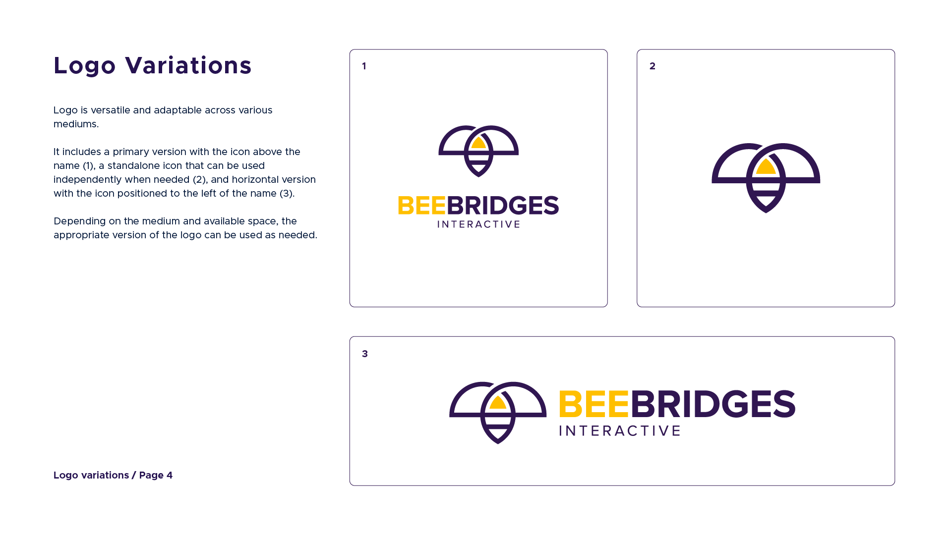
The objective was to create a clean, geometric logo that combines the bee and bridge in a meaningful way. The final mark needed to feel simple, distinctive, and balanced, while also communicating connection, collaboration, and solidarity.
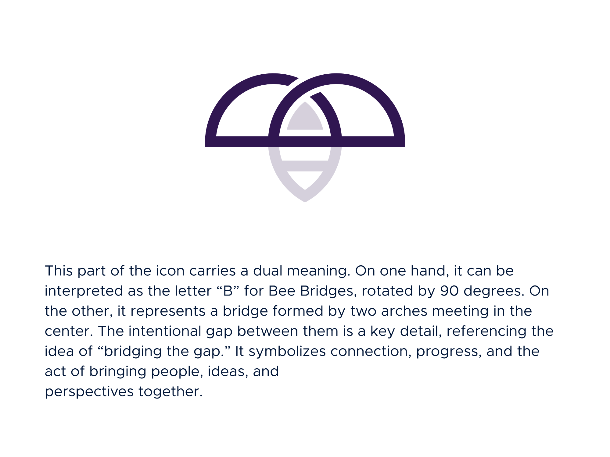
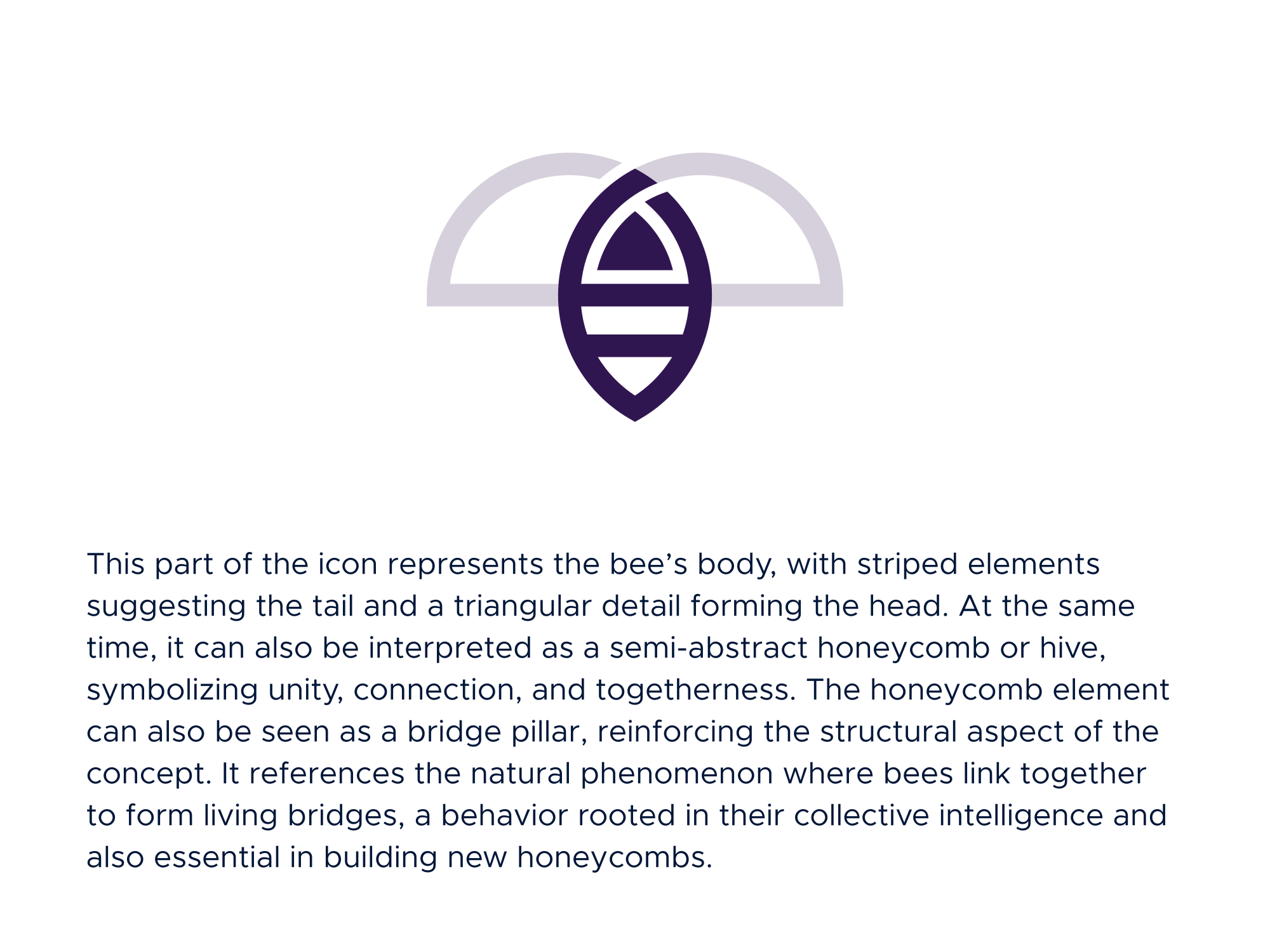
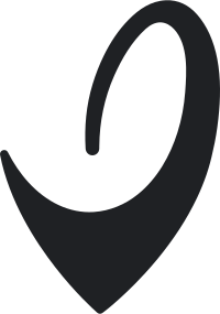
The logo icon is designed with flowing lines that come together to form a bee, using geometric shapes to create a balanced and clean appearance. Beyond the primary form, the symbol also carries additional meanings connected to the brand.
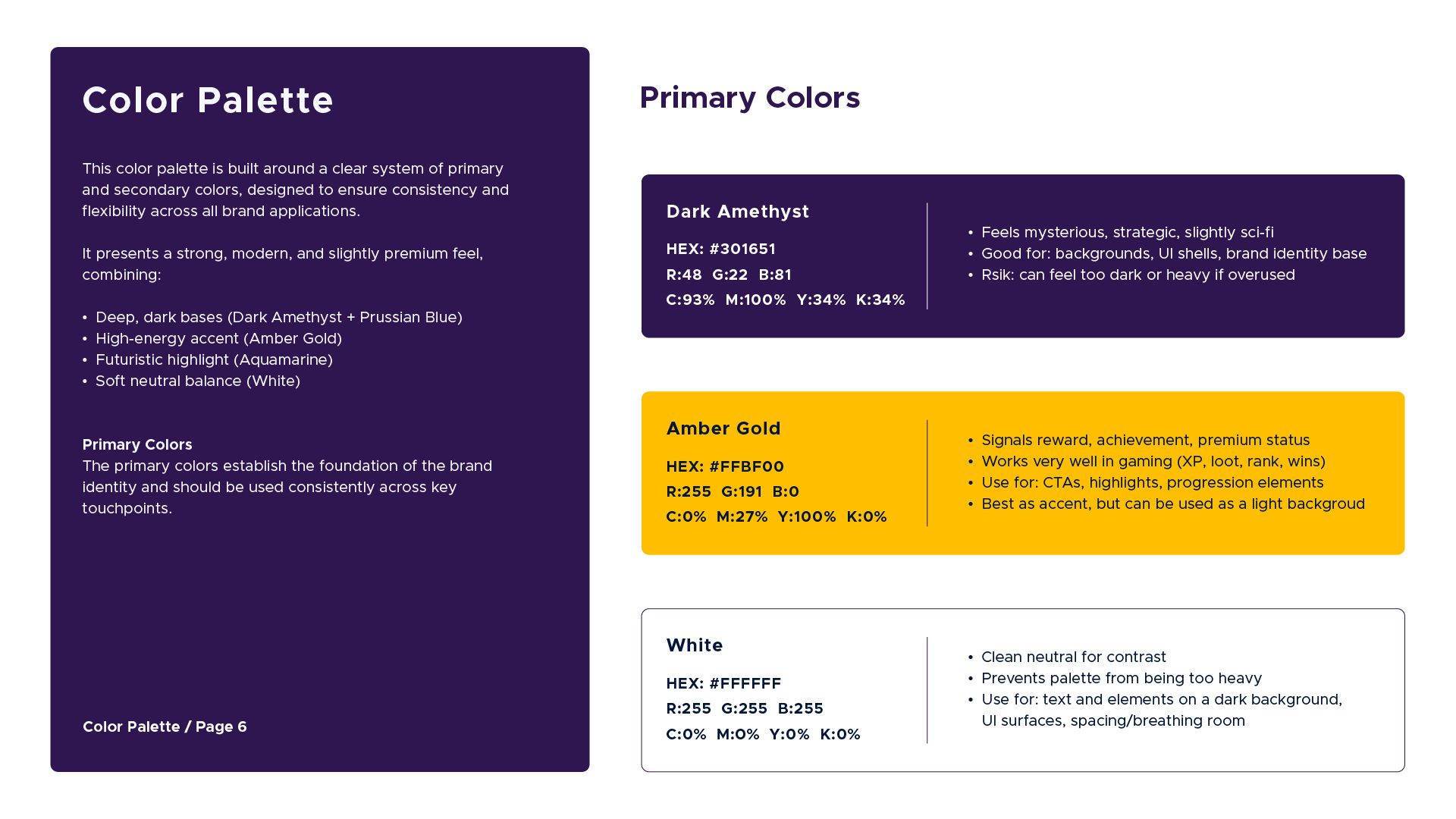
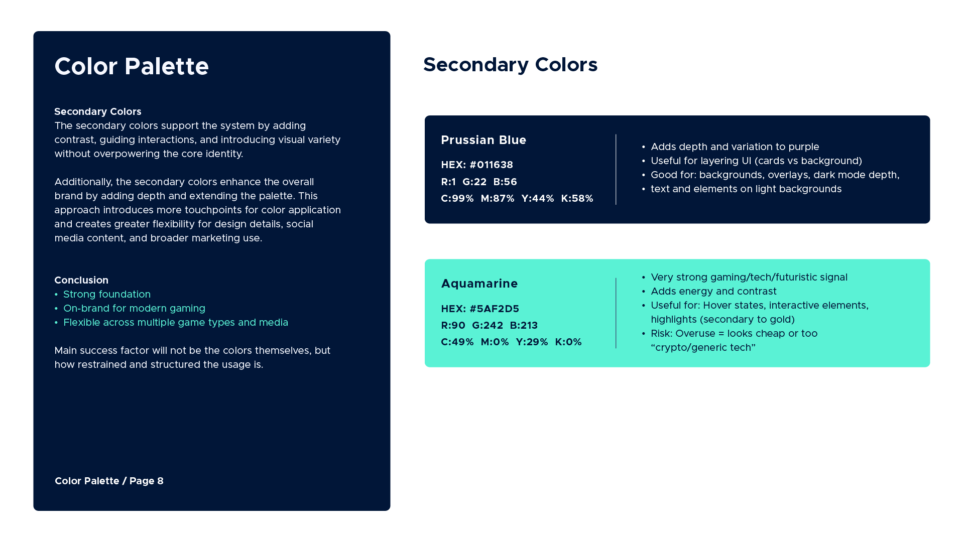
Bee Bridges’ color system is built around two distinct palettes, primary and secondary, creating a flexible yet consistent foundation for all brand applications.
This two-way color system presents a strong, modern, and slightly premium feel, combining:
• Deep, dark bases (Dark Amethyst + Prussian Blue)
• High-energy accent (Amber Gold)
• Futuristic highlight (Aquamarine)
• Soft neutral balance (White)
The primary color palette is warm, soft, and approachable, with a refined and slightly premium feel. It conveys a strong sense of togetherness and unity, while subtle accents introduce a touch of playfulness and energy. This balance creates a friendly yet
polished visual tone that supports both community-driven messaging and a modern brand presence.
The secondary colors support the system by adding contrast, guiding interactions, and introducing visual variety without overpowering the core identity. Additionally, the secondary colors enhance the overall brand by adding depth and extending the palette. This approach introduces more touchpoints for color application and creates greater flexibility for design details, social media content, and broader marketing use.
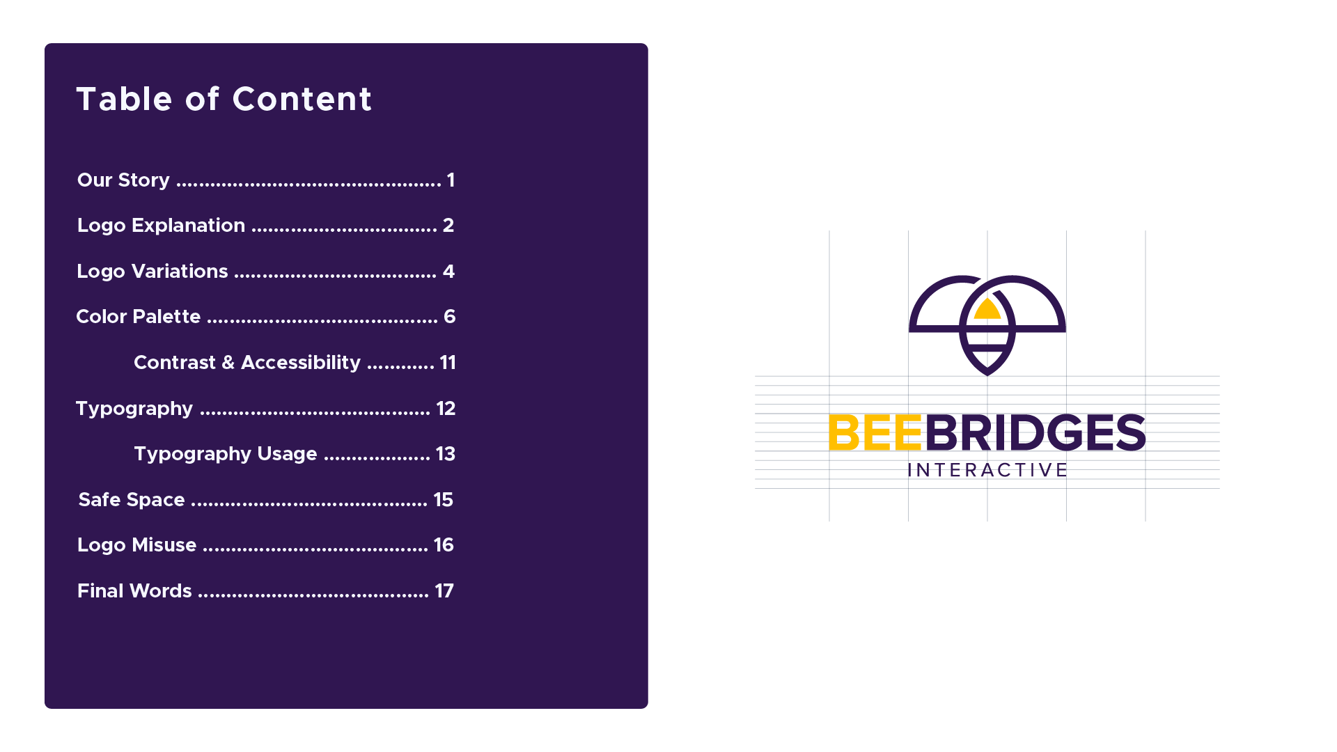
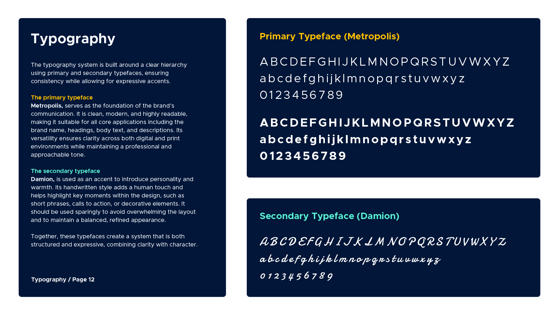
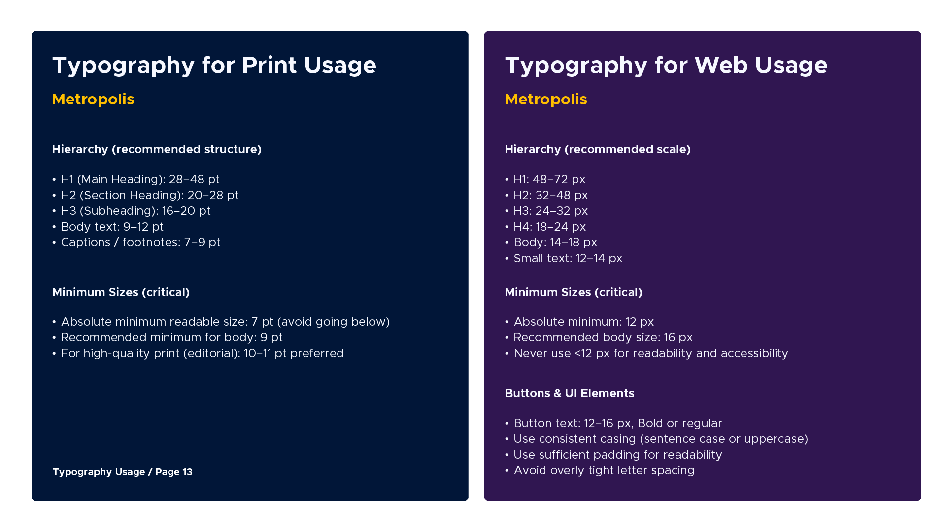
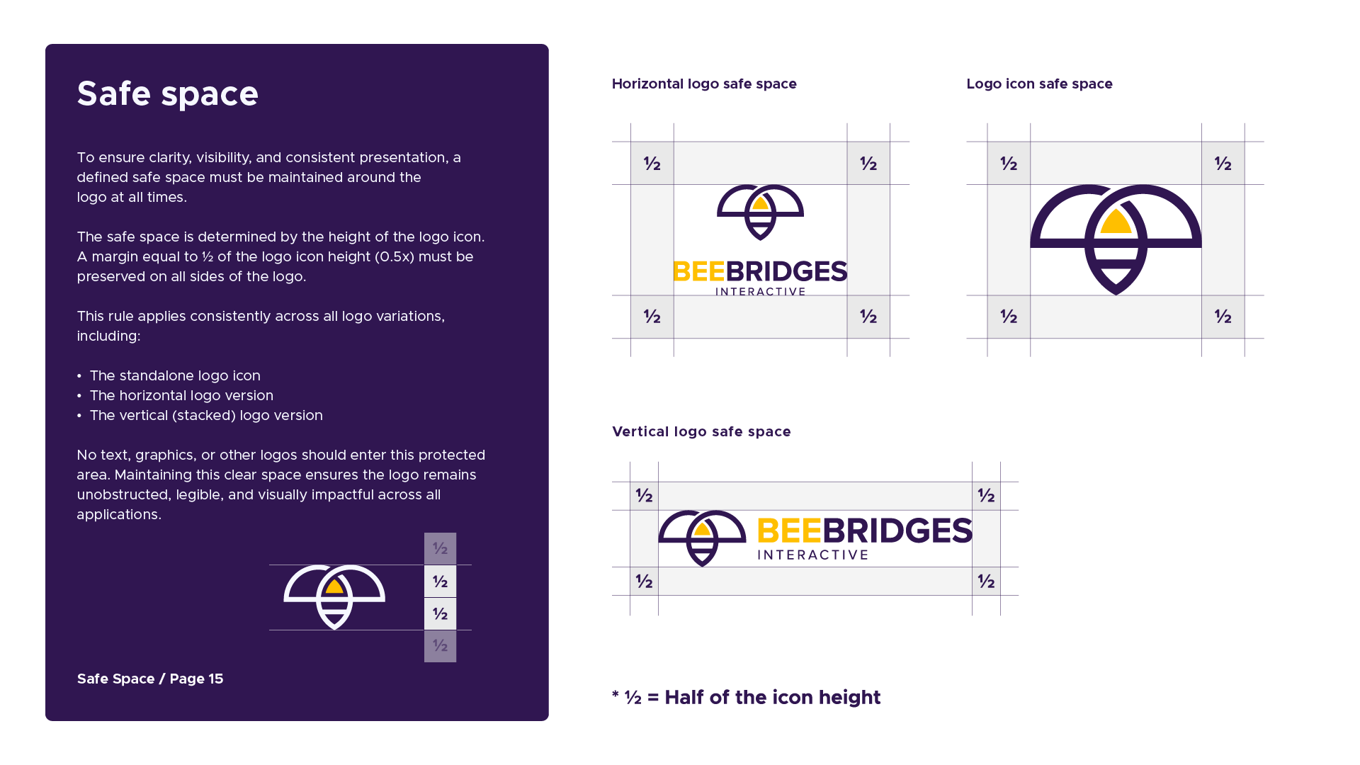
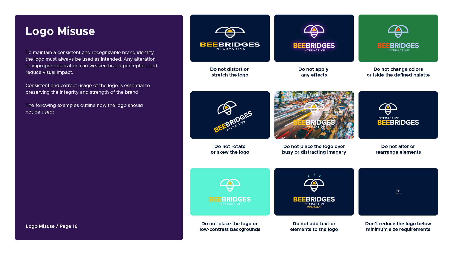
The brand guidelines bring the whole visual identity together in one clear and practical place. They cover the brand story, logo usage, colors, typography, and how all of these elements should work together across different formats and media. They also include examples of what to avoid, helping keep the identity consistent without making the system feel too rigid. The result is a useful reference that makes it easier for anyone working with the brand to keep things looking and feeling like the same brand.
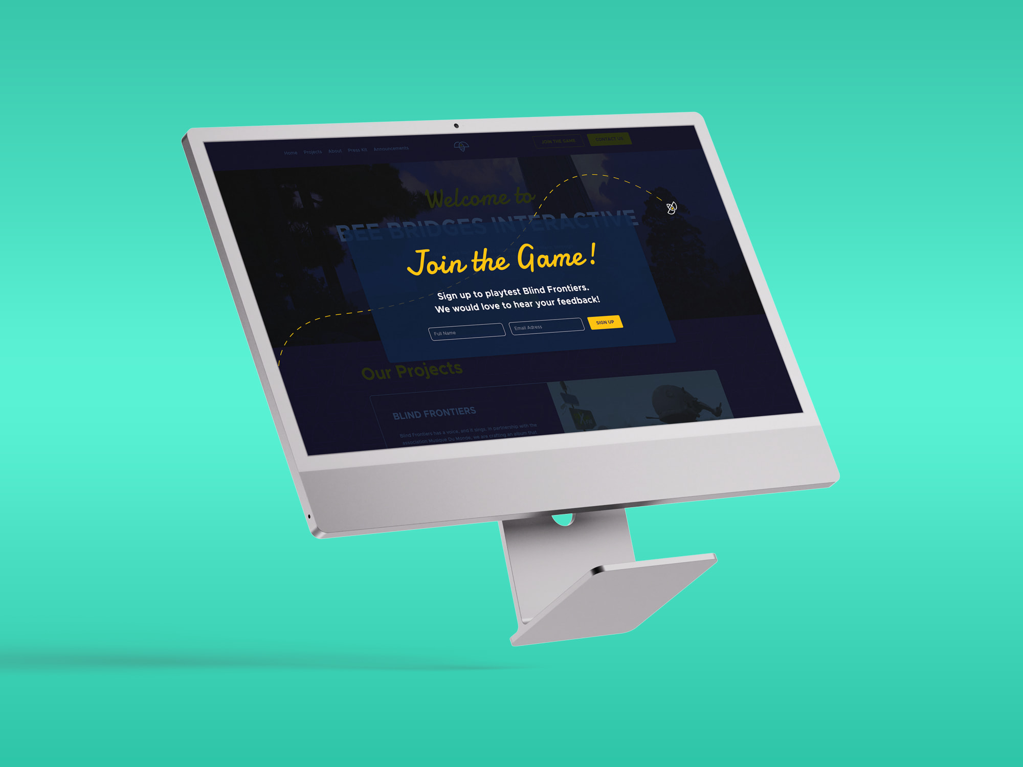
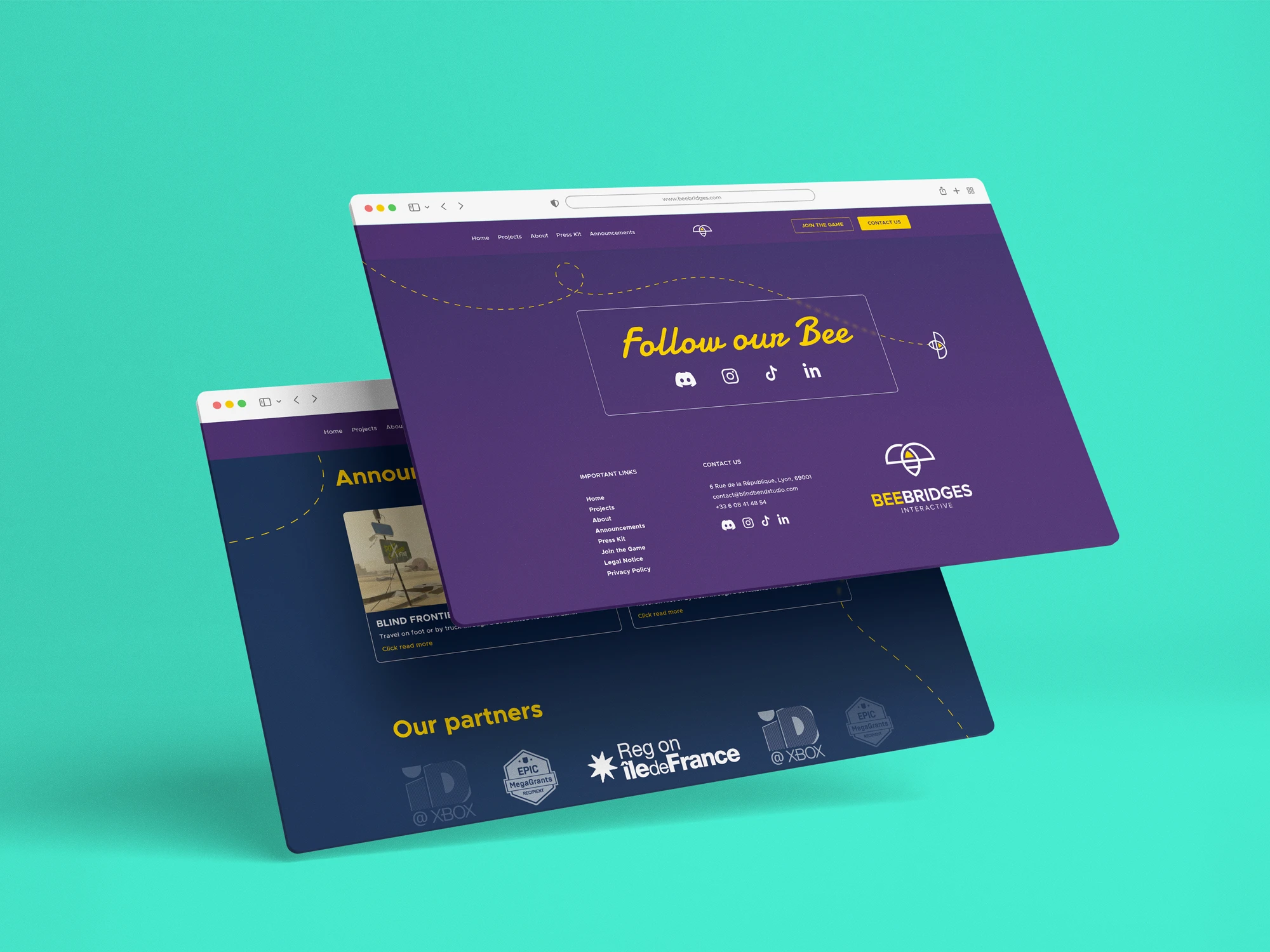
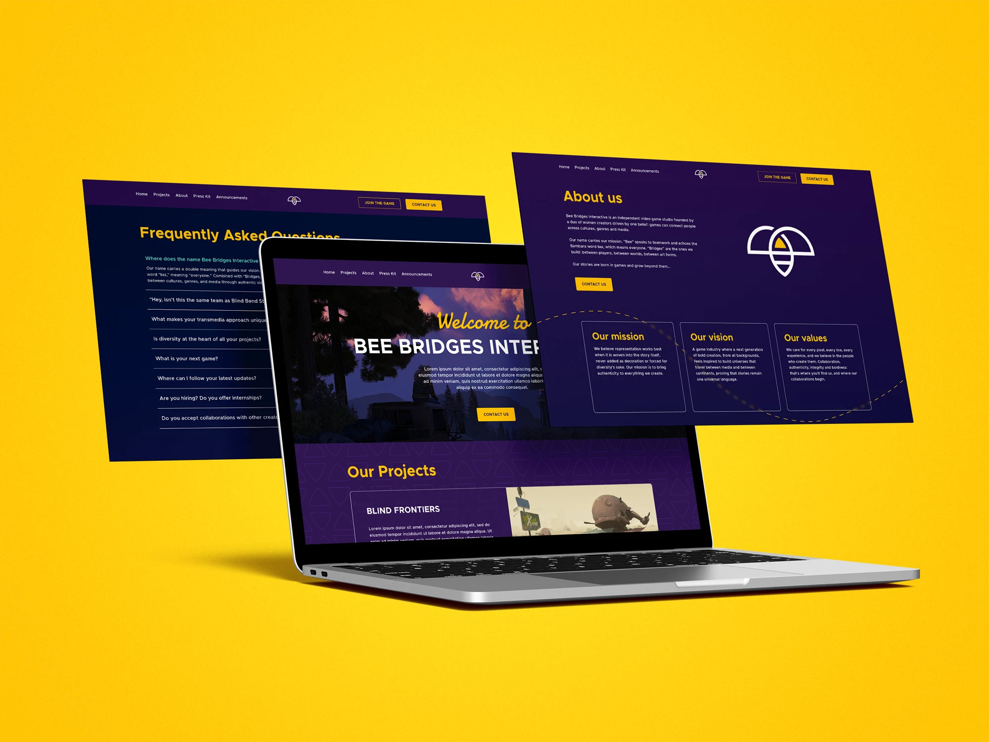
The next step was bringing the full visual identity to life through the website in a clear, creative, and engaging way. We handled both the design and implementation, using Figma for the design process and WordPress with Elementor for the final build. The result is a vibrant and colorful website that feels fully connected to the brand, carrying the same tone through its colors, typography, layout, and supporting design elements. Every section was designed to feel like a natural extension of the identity, creating a consistent experience from the first impression to the final interaction.