AKL logistics

Simple, Unique & Memorable


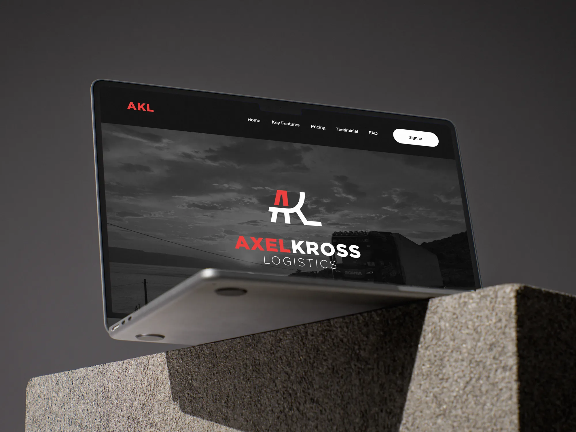
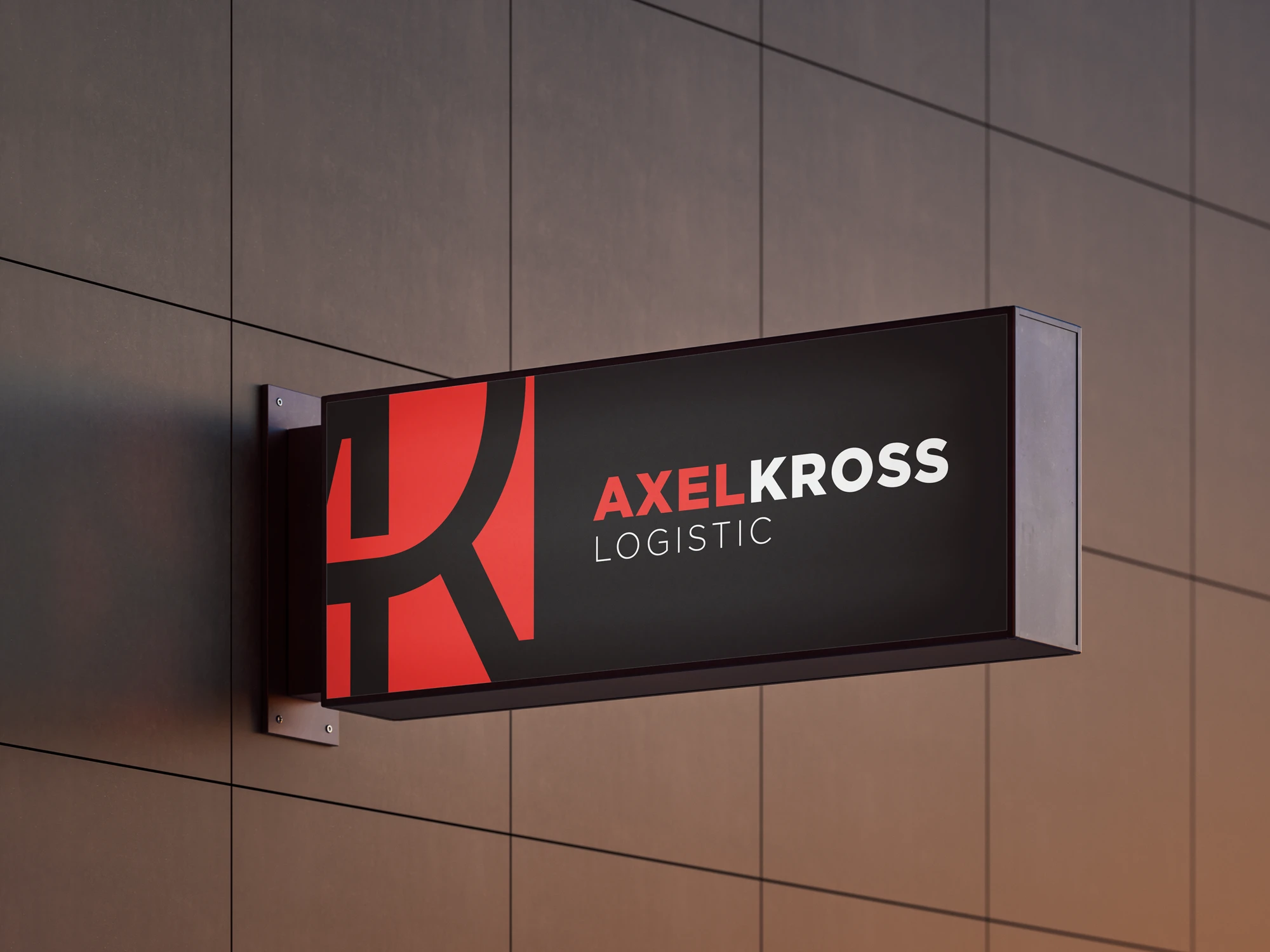
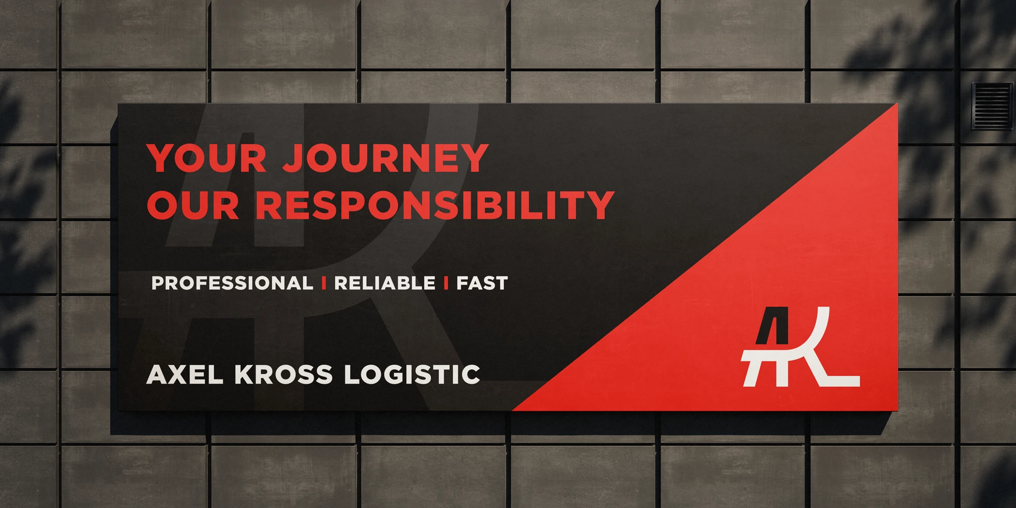
AKL is a logistics and trucking company named after its founder. A distinctive letter mark built around the initials AKL, creating a strong and recognizable visual identity in the industry.

Project Scope:


  • Logo design
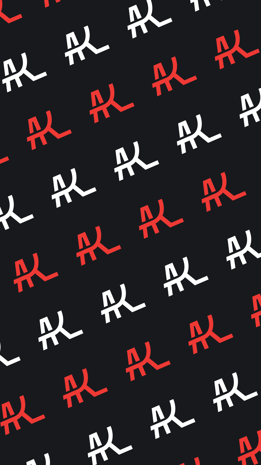
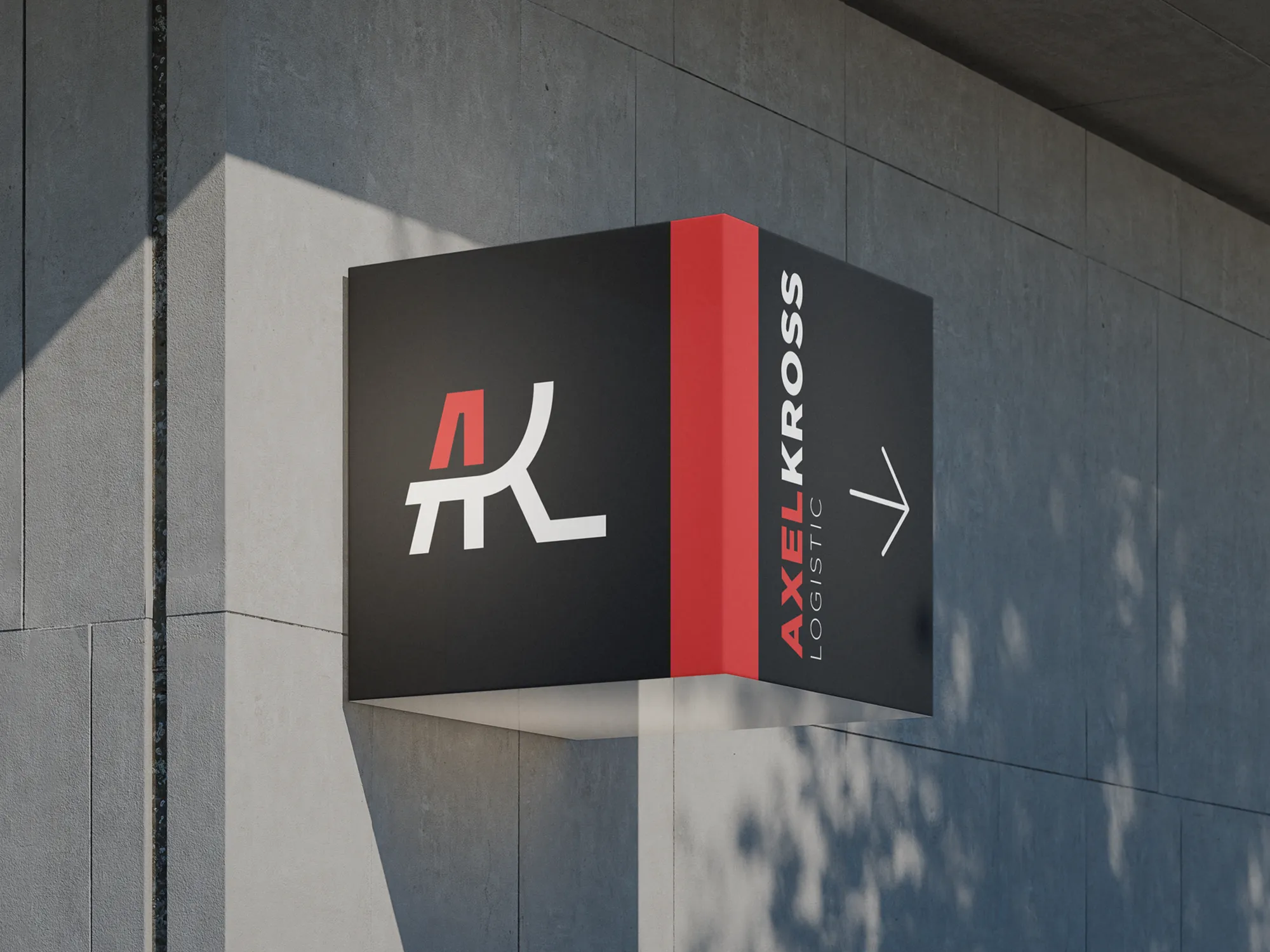
  • Visual identity
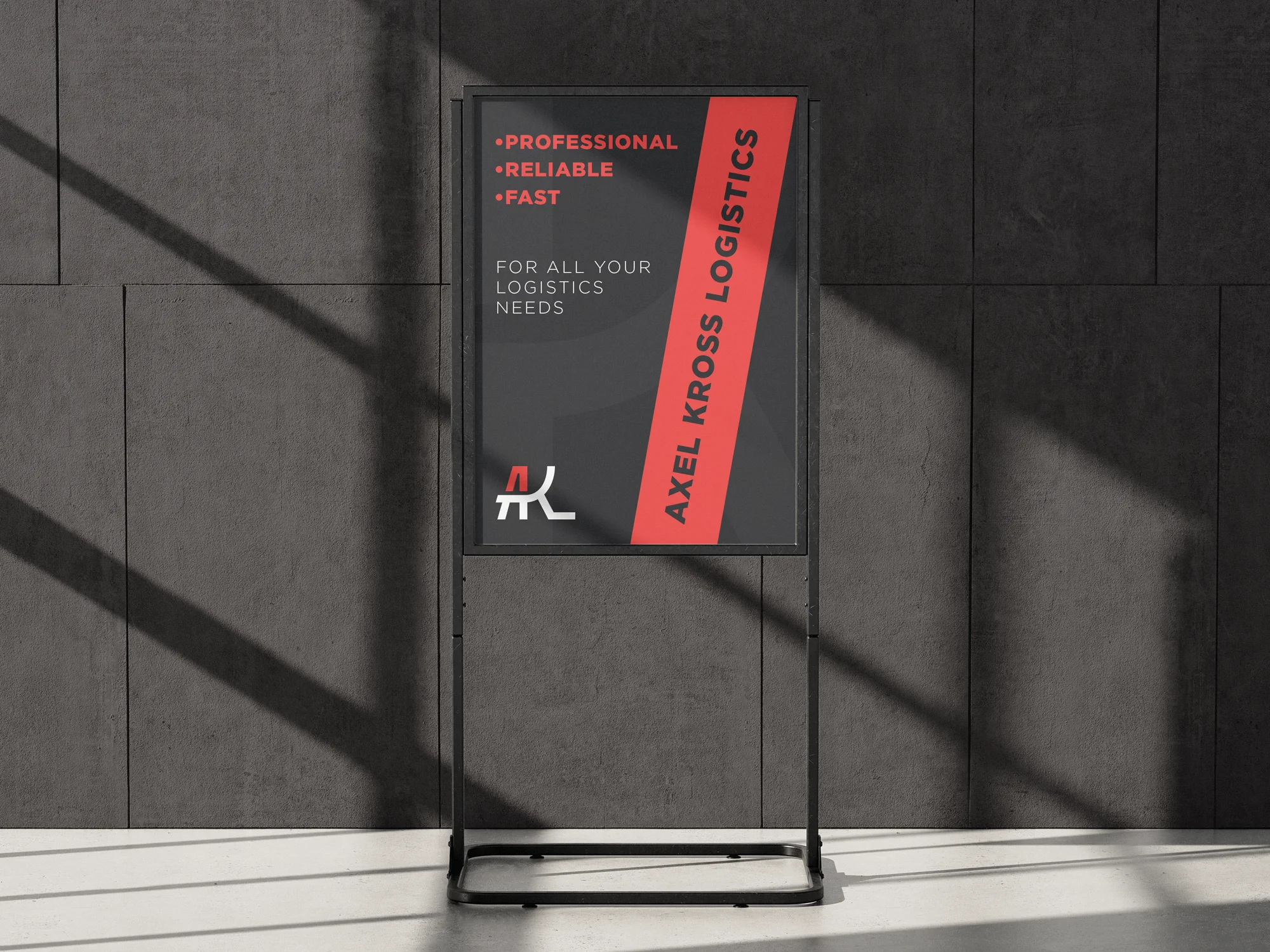
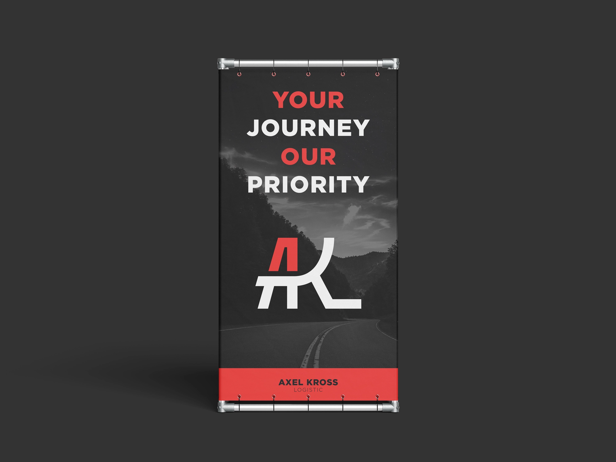
  • Print design

Objectives & requirements

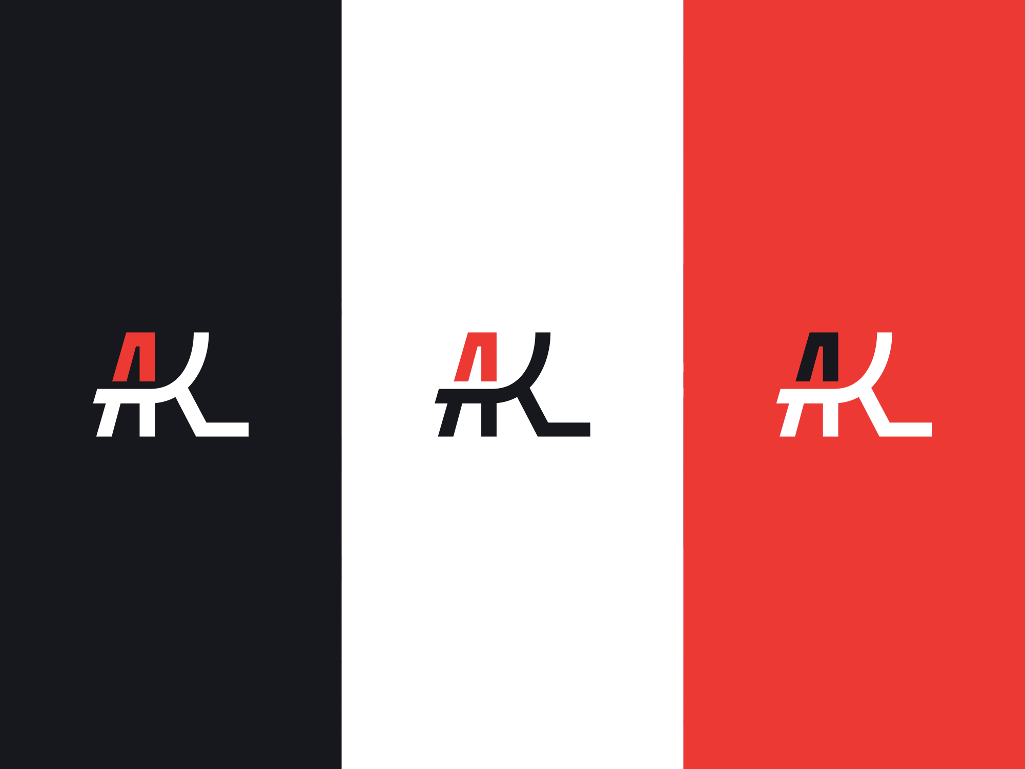
The visual direction focused on combining the founders’ initials in a clear, simple, and recognizable way, while subtly referencing the logistics and trucking industry. Red was an important part of the color palette, with the identity designed to work equally well across both light and dark backgrounds. The primary visual direction leans toward darker applications, creating a strong, modern look with a predominantly black-based brand aesthetic.


Idea behind the logo mark

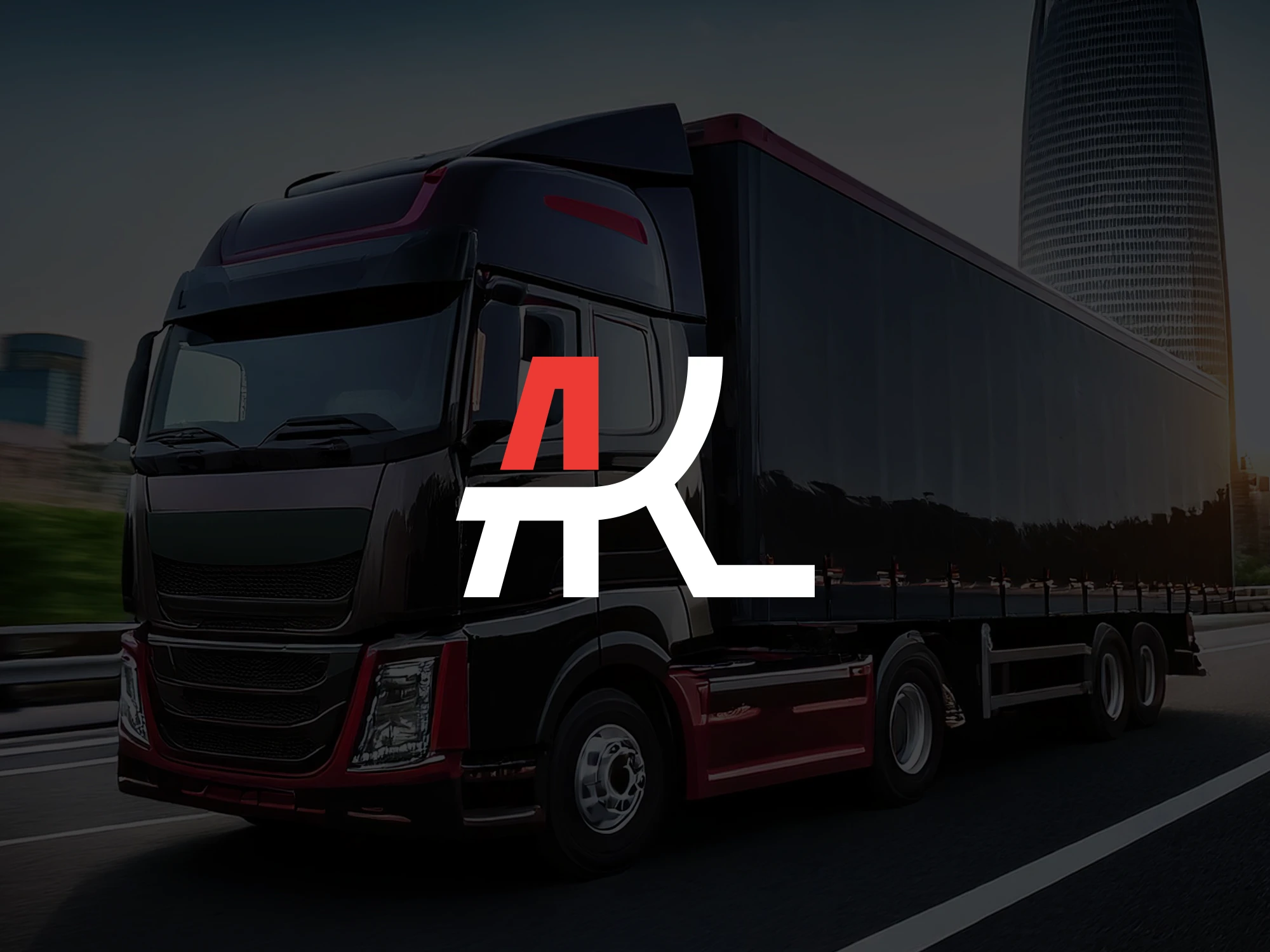
This concept combines the three letters into a custom symbol. The letter A forms a road disappearing into perspective, while the remaining letters continue the visual flow and create a second road element. This approach keeps the initials clear and readable while giving the wordmark a meaningful connection to transportation, movement, and the logistics industry.

COLOR PALETTE

The color palette was built around three key requirements:


  1. A strong red tone to serve as a primary or accent color across the identity.
  2. Versatile primary colors that work equally well on both light and dark backgrounds.
  3. A darker overall visual direction, supporting a bold, modern identity with black-based applications at its core.
AKL Color 1
AKL Color 2
AKL Color 3
AKL Color 4
AKL Color 5
AKL Color 6

Built to Move Forward

The final identity brings together the founders’ initials with subtle references to logistics and trucking in a clean, recognizable mark. A strong red accent and dark visual direction give the brand a confident, modern presence across both light and dark applications. The result is a flexible identity that feels professional, distinctive, and built for a fast-moving industry.