Saraja App

Augmented reality

Saraja was designed as a city guide that connects digital and real-world experiences through augmented reality.


The app combines AR with practical services such as maps, business information, payments, chat, and tools for exploring the city and surrounding areas.


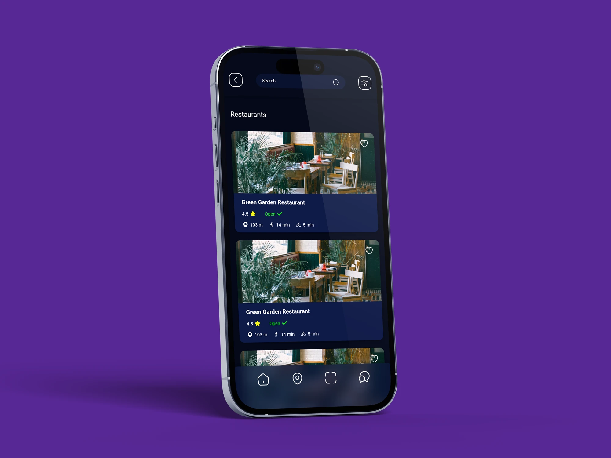
It also provides a dedicated platform for local businesses to present their services and connect with visitors. Designed primarily with tourists in mind, the app aims to make discovering and navigating a new city more intuitive, interactive, and engaging. By bringing multiple services into one platform, Saraja creates a more connected experience for both visitors and local businesses.

Project Scope:

  • UI/UX Design
  • Augmented Reality Design
  • e-Wallet Design
  • Navigation Design
  • Chat service Design
  • Service Section Design

Project scope & Challenges

The project scope was to design a single app that brings together multiple services and experiences within one connected ecosystem. The main challenge was creating a seamless user experience and smooth transitions between very different sections, while keeping augmented reality as the central feature of the product.


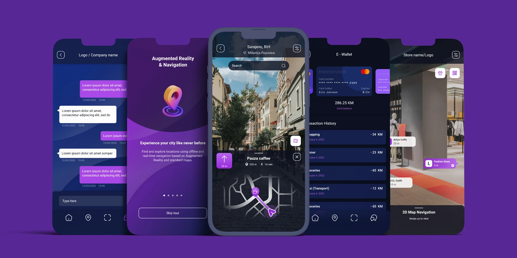
The app included sign-in and sign-up flows, onboarding and introduction screens, a main home screen, explore section, business listings and profiles, an e-wallet, chat functionality, indoor and outdoor augmented reality experiences, maps, commercial features, and a personal account area with settings and preferences.


Each section needed to function independently while still feeling like part of the same product. The overall goal was to make a complex, feature-rich platform feel intuitive, consistent, and easy to navigate.

onboarding & introduction screens

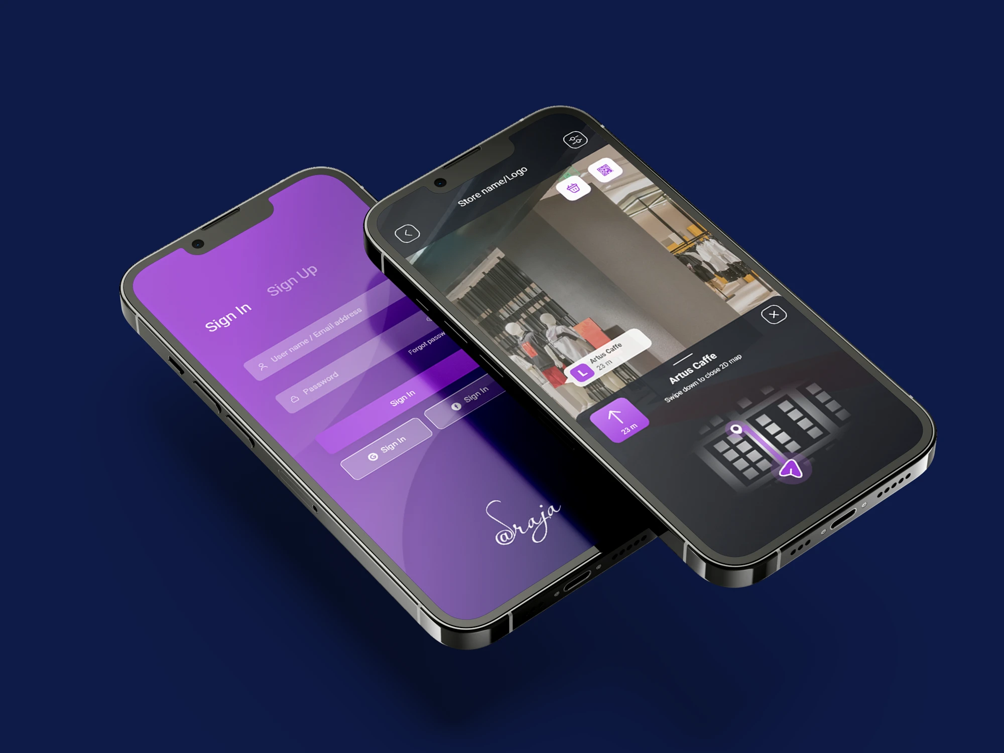
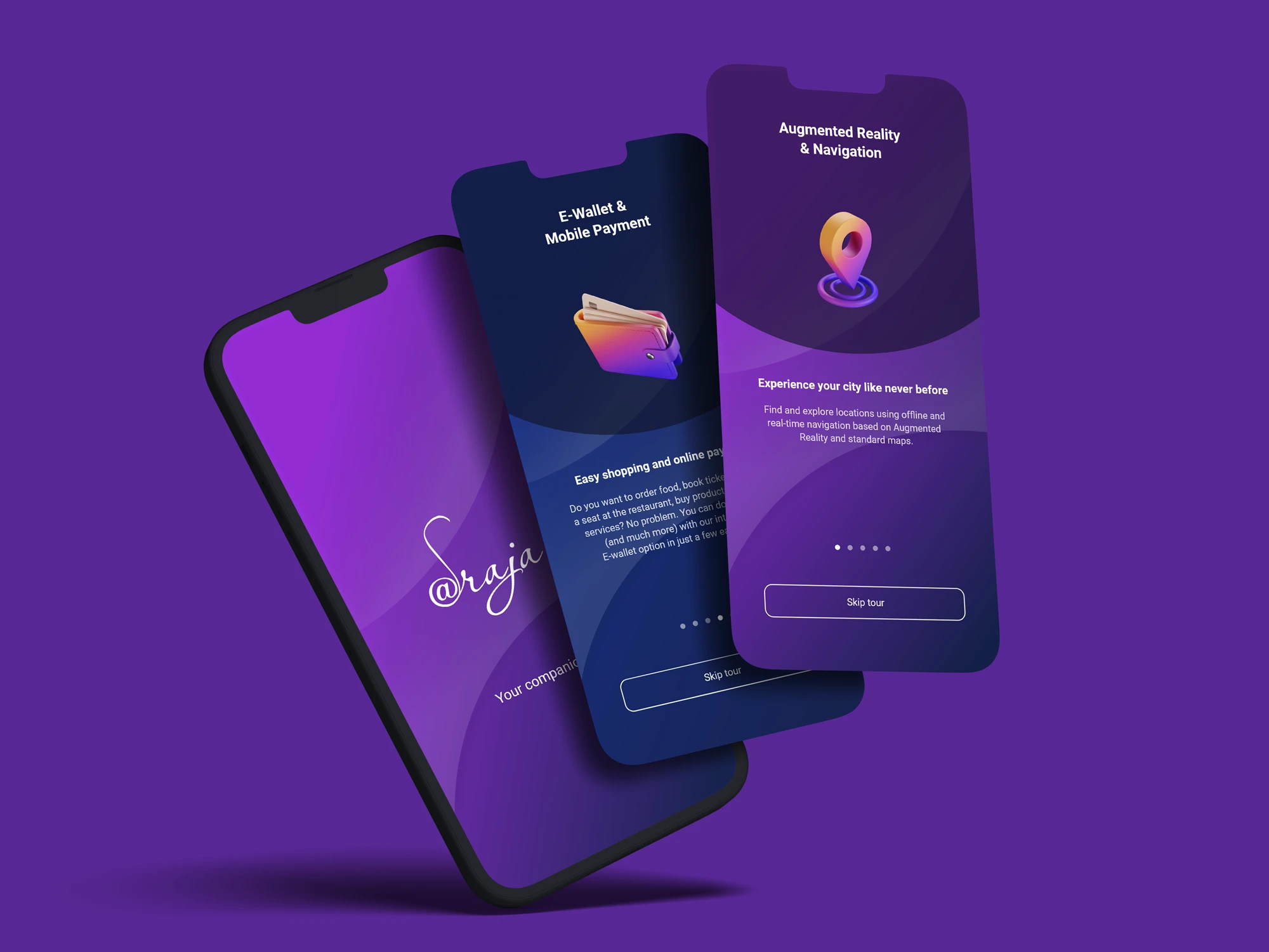
The experience begins with simple sign-in and sign-up screens that provide a clear and straightforward entry into the app. After creating an account and entering the app for the first time, users are guided through a series of introduction screens explaining how the platform works and highlighting its key features.


The onboarding flow was designed to make the app’s wide range of services feel easy to understand from the very beginning.

Navigation & explore section

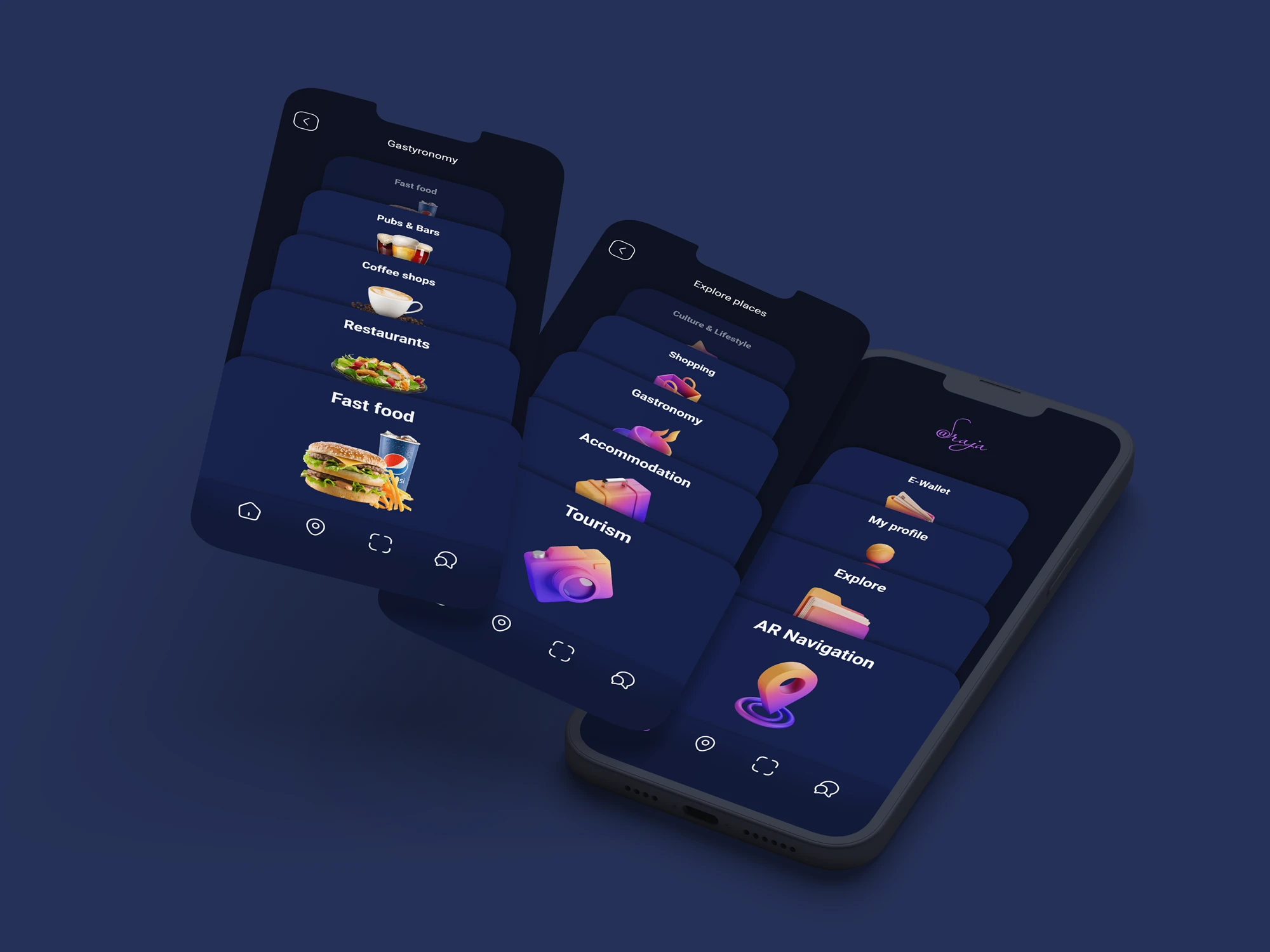
The app uses two complementary navigation flows to keep the experience simple and intuitive.


The primary navigation sits in the bottom bar and remains accessible at all times, giving users quick access to the main sections of the app.


The secondary navigation starts from the home screen, which acts as the central hub for exploring content and accessing key features and services. Together, these two navigation systems make it easier to move through a complex app without making the experience feel overwhelming.

Business profile

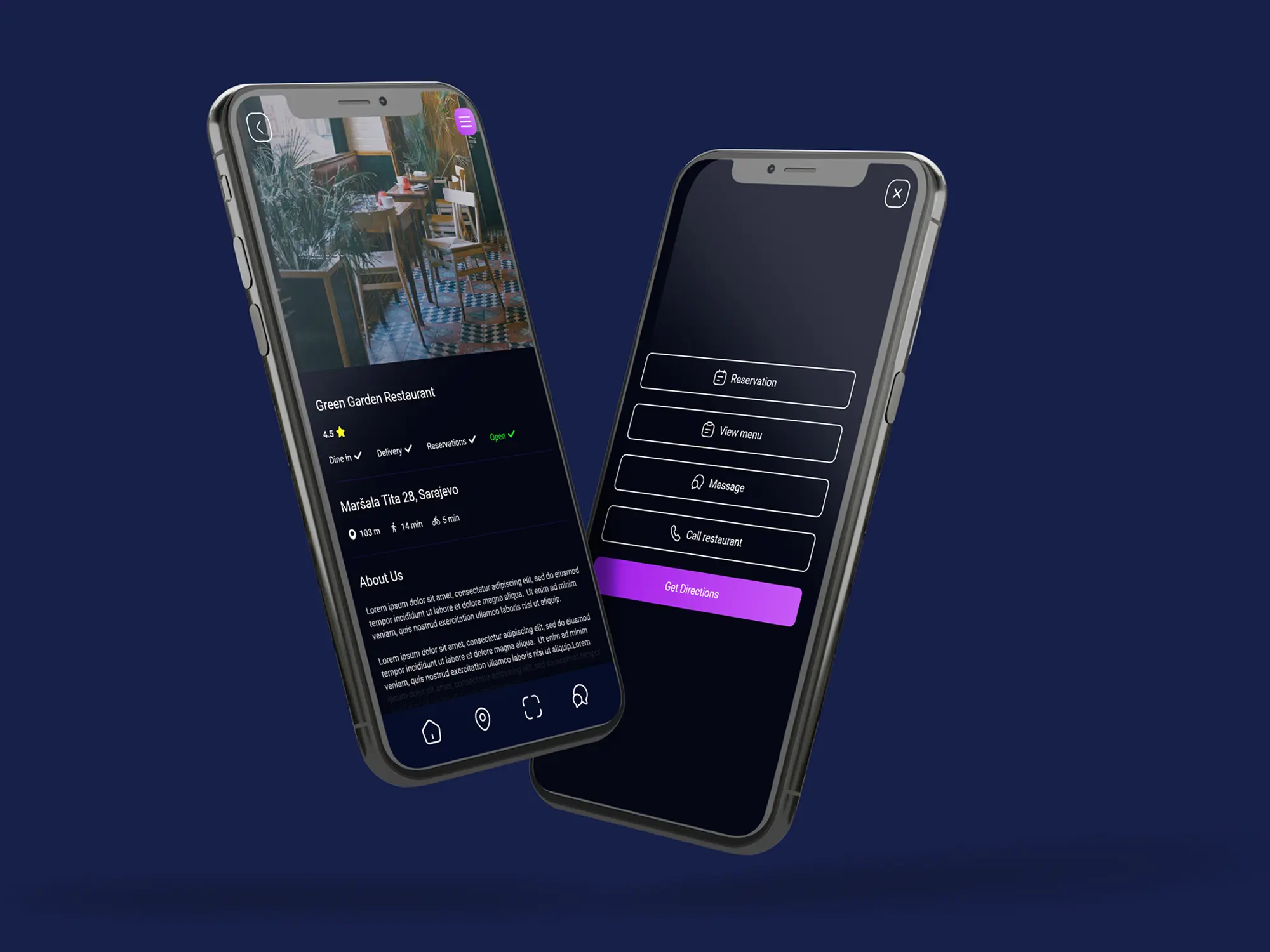
Every business featured in the app has its own dedicated profile page, with the layout adapting slightly depending on the type of business.


Each profile follows the same core structure, including the business name, address and navigation options, key information or features, and relevant CTA buttons. This creates a consistent experience for users while still giving each business enough flexibility to present the information that matters most.


The profiles were designed to make discovering, evaluating, and contacting local businesses as simple as possible.

Chat service

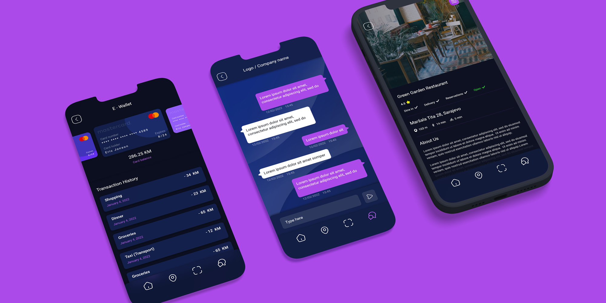
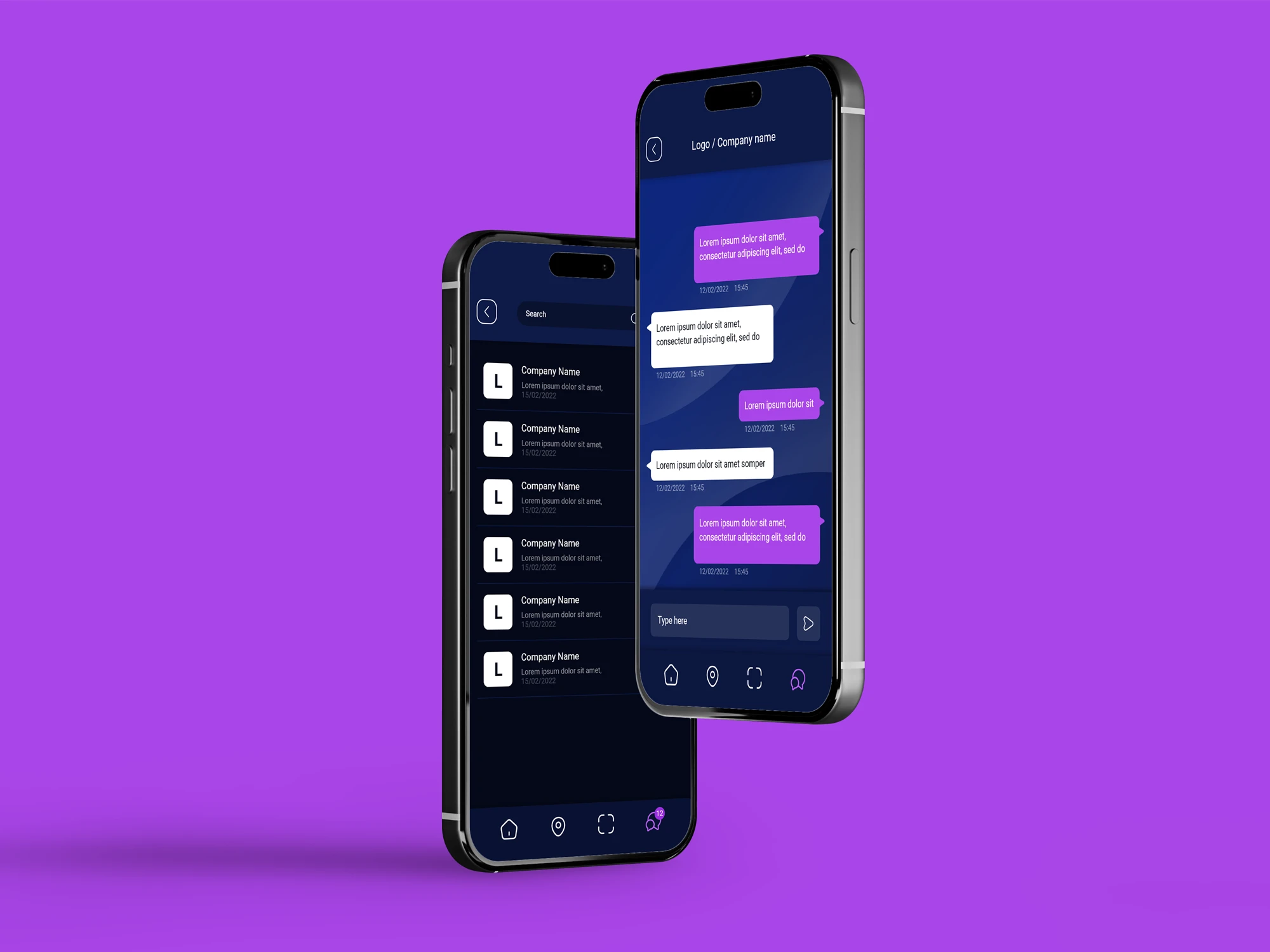
One of the app’s key features is the ability for users to contact selected businesses directly through an integrated chat service.


The available options depend on the individual business, but users may, for example, reserve a table at a restaurant and then continue the conversation through chat if they need to ask questions or update their reservation.


This creates a more direct connection between users and local businesses without requiring them to leave the app. It also makes the overall experience more convenient by keeping communication and services in one place.

e-Wallet

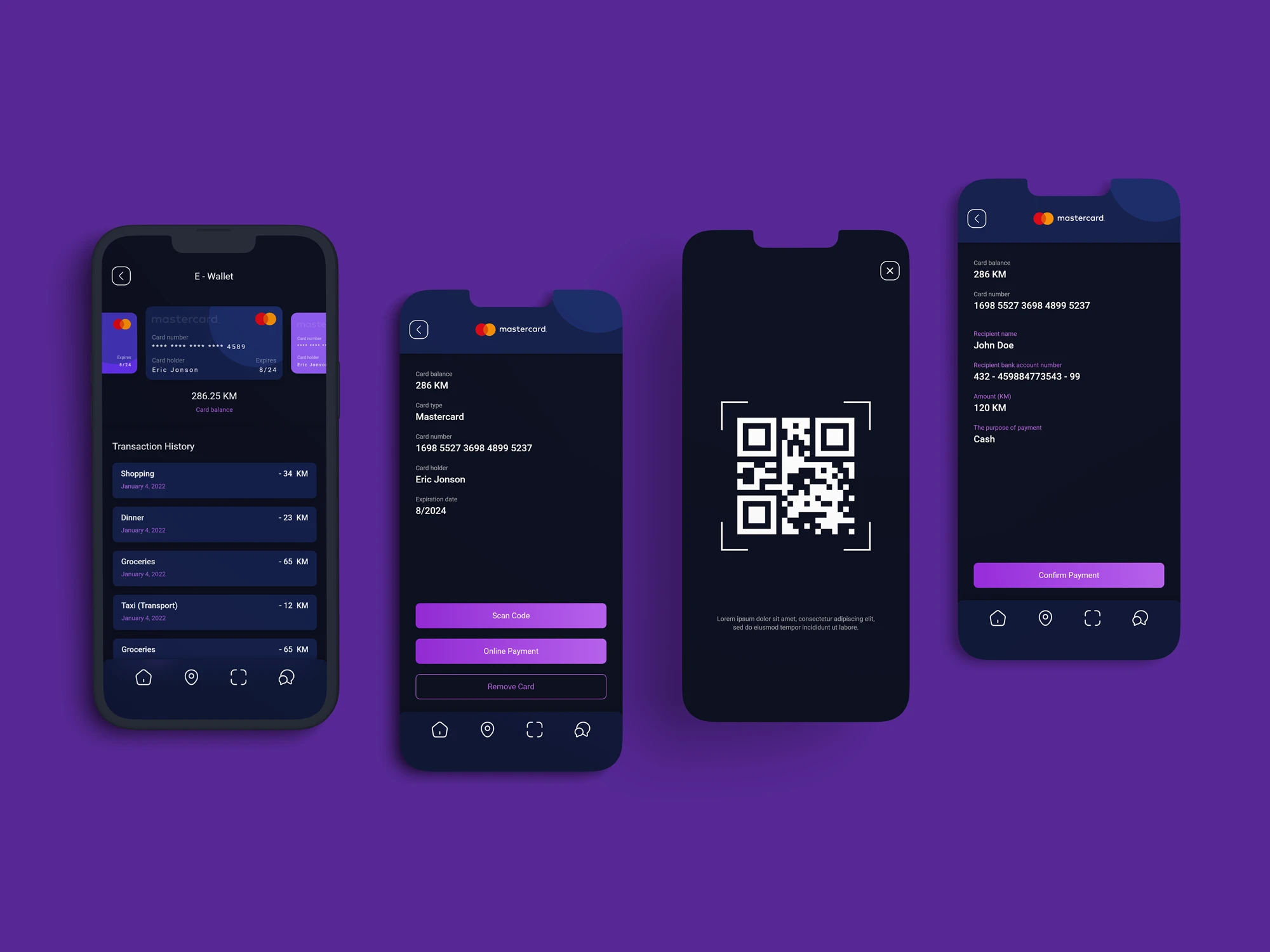
The challenge was to introduce a complete payment experience without making the app feel more complex or fragmented. Since payments sit alongside features like business discovery, booking, and chat, the design needed to make this transition feel natural and easy to follow.


We created a dedicated payment area that brings together the user’s balance, saved cards, transaction history, and other key payment information in one clear interface. The focus was on keeping the structure simple and familiar, while maintaining the same visual language used throughout the rest of the app.


By designing the payment flow as part of the wider user journey, rather than as a separate feature, we were able to create a smoother experience from discovering a business to booking, communicating, and completing a payment.

Outdoor AR

Augmented reality was the central feature of the app, so one of the main design challenges was creating an AR system that could support both indoor and outdoor experiences while still feeling like one consistent product.


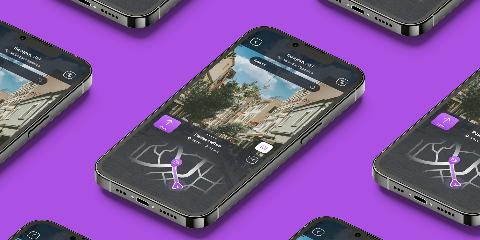
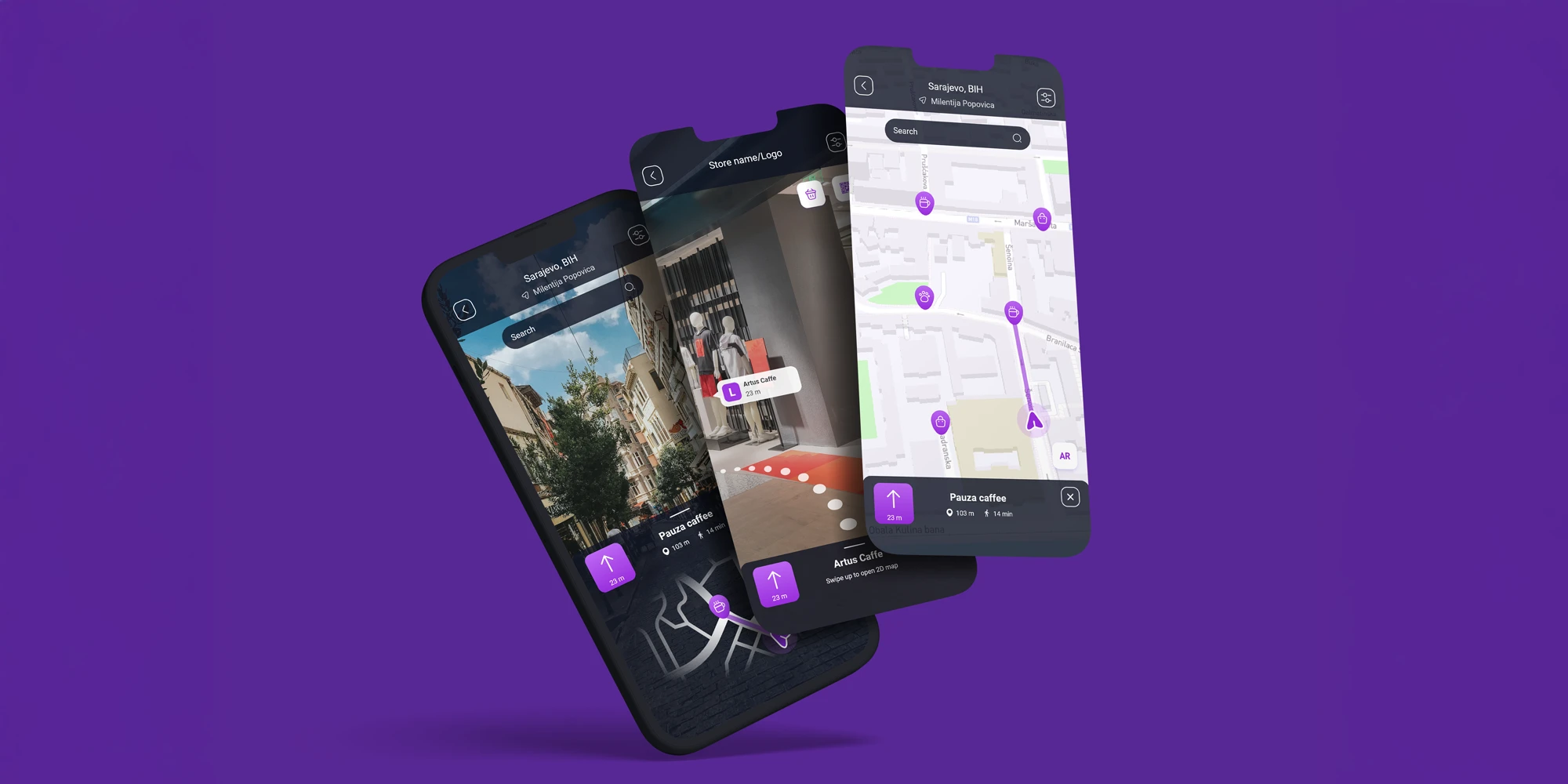
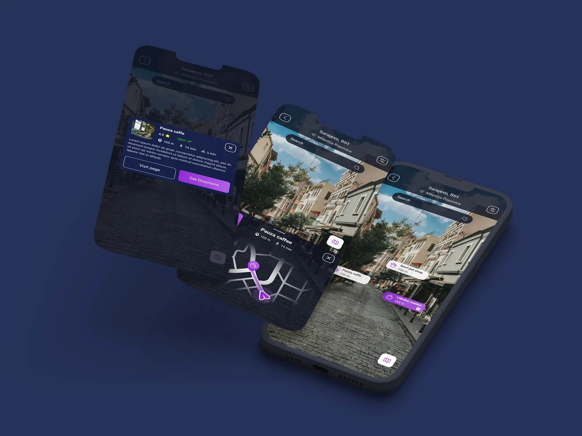
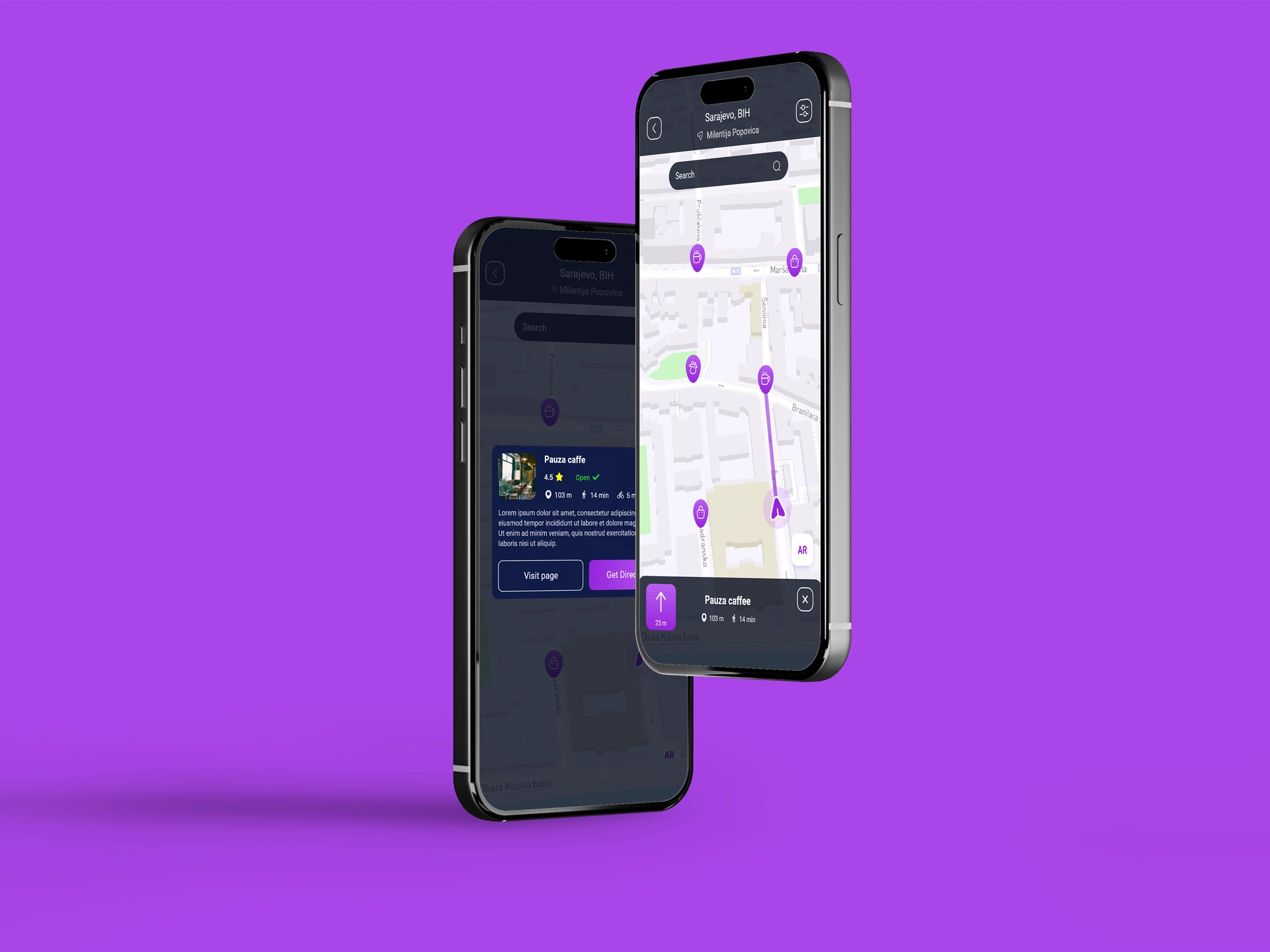
For the outdoor experience, we designed three connected navigation modes. The first is a branded 2D map that works in a familiar way while incorporating Saraja’s visual language and location-specific information. The second is a camera-based AR mode that displays nearby businesses and points of interest directly within the user’s surroundings. The third combines both approaches, using AR together with the 2D map to guide users toward a selected destination.


The challenge was to make these modes feel different enough to serve their individual purposes, but similar enough that users could move between them without having to learn a new interaction pattern each time. Consistent controls, visual hierarchy, icons, and branding were used across all three experiences to create that continuity.


We also needed to make sure AR was more than just a navigation tool. From the same experience, users can explore business profiles, listings, museums, cultural locations, events, and other points of interest, turning the AR interface into a broader discovery layer for the city.


Indoor AR

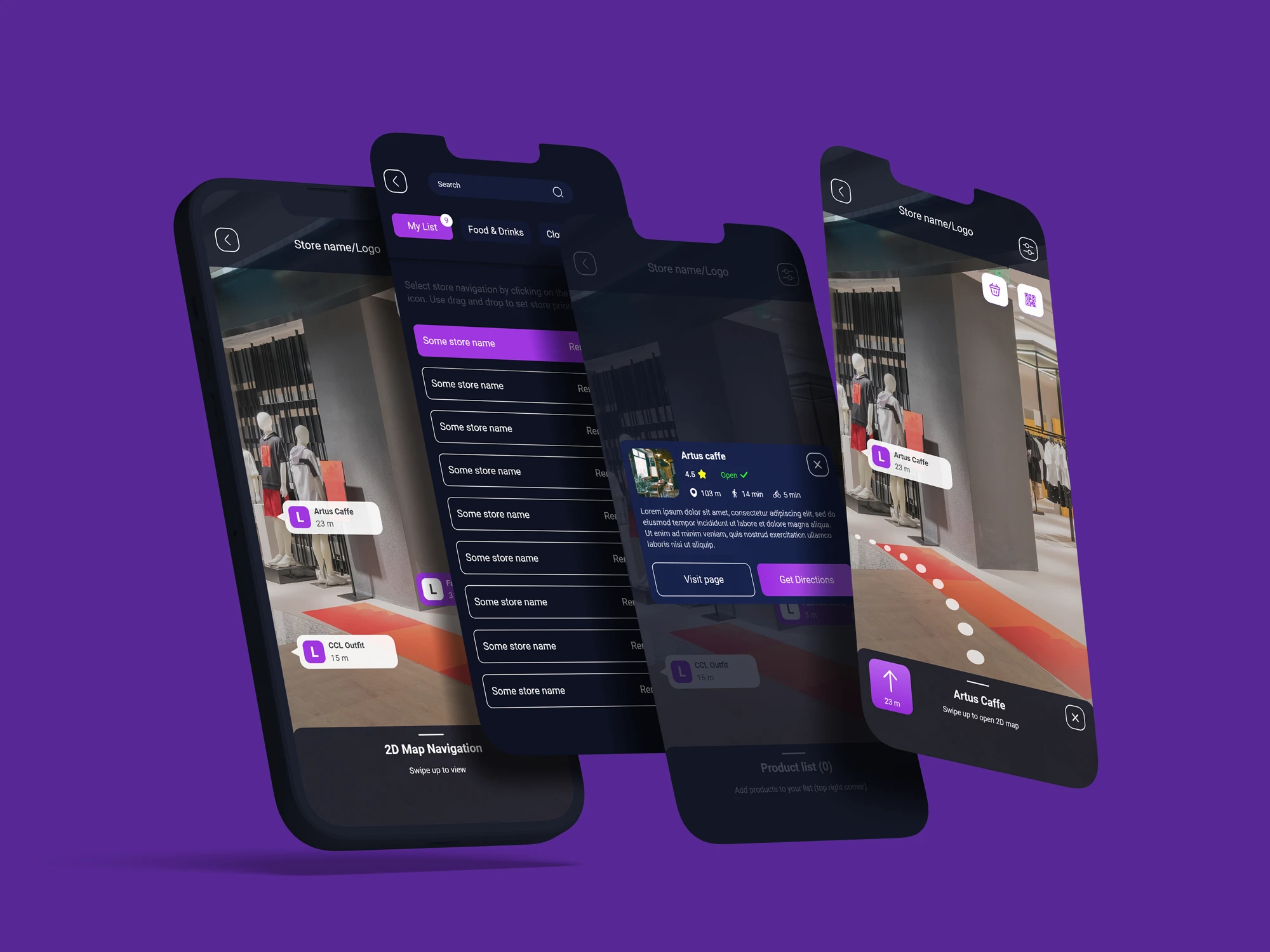
The indoor AR experience needed to feel like a natural extension of the outdoor system, while adapting to much more specific environments and user needs. The main design challenge was keeping the same interaction logic and visual language, but introducing additional layers of information depending on the type of location.


In environments such as shopping malls, users can explore store listings and navigate through the space using the same map and camera-based AR interactions they already know from the outdoor experience. This consistency reduces the learning curve and makes switching between indoor and outdoor navigation feel seamless.


For more complex spaces, such as supermarkets, the AR experience becomes more task-focused. Users can search for specific products, explore available inventory, and receive visual guidance directly to the item’s location. The interface was designed to introduce these additional functions without making the experience feel overcrowded or unfamiliar.

Maps

The main challenge with the 2D map was finding the right balance between familiarity and brand identity. Users already understand how platforms like Google Maps or Apple Maps work, so the interaction patterns needed to feel intuitive and immediately recognizable rather than introducing a completely new navigation system.


We kept the core map experience familiar, while adapting the visual language to Saraja through branded colors, icons, markers, and location details relevant to the app. The information hierarchy was also adjusted to prioritize businesses, points of interest, events, and other content that supports the wider city-guide experience.


This approach allowed the map to feel easy to use from the first interaction, while still being clearly connected to the rest of the Saraja product.