SANDRAX

Built on Strength, Driven by Discipline


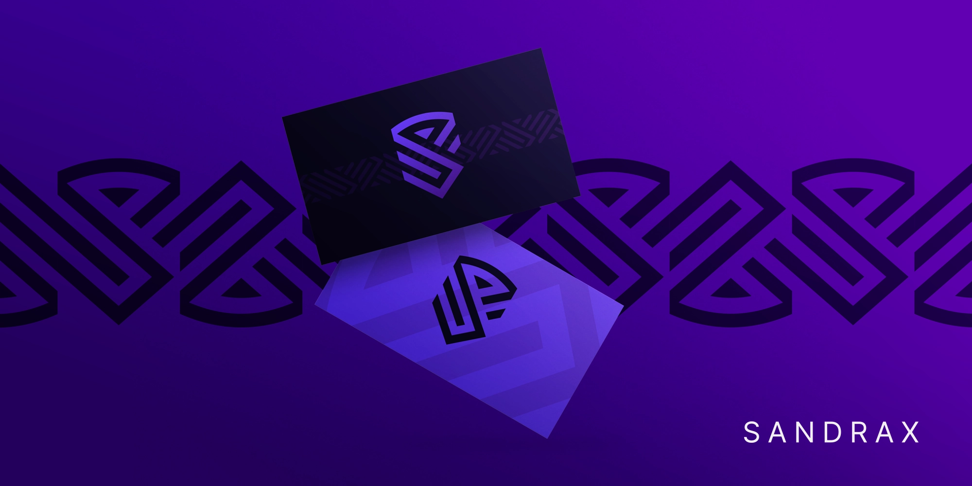
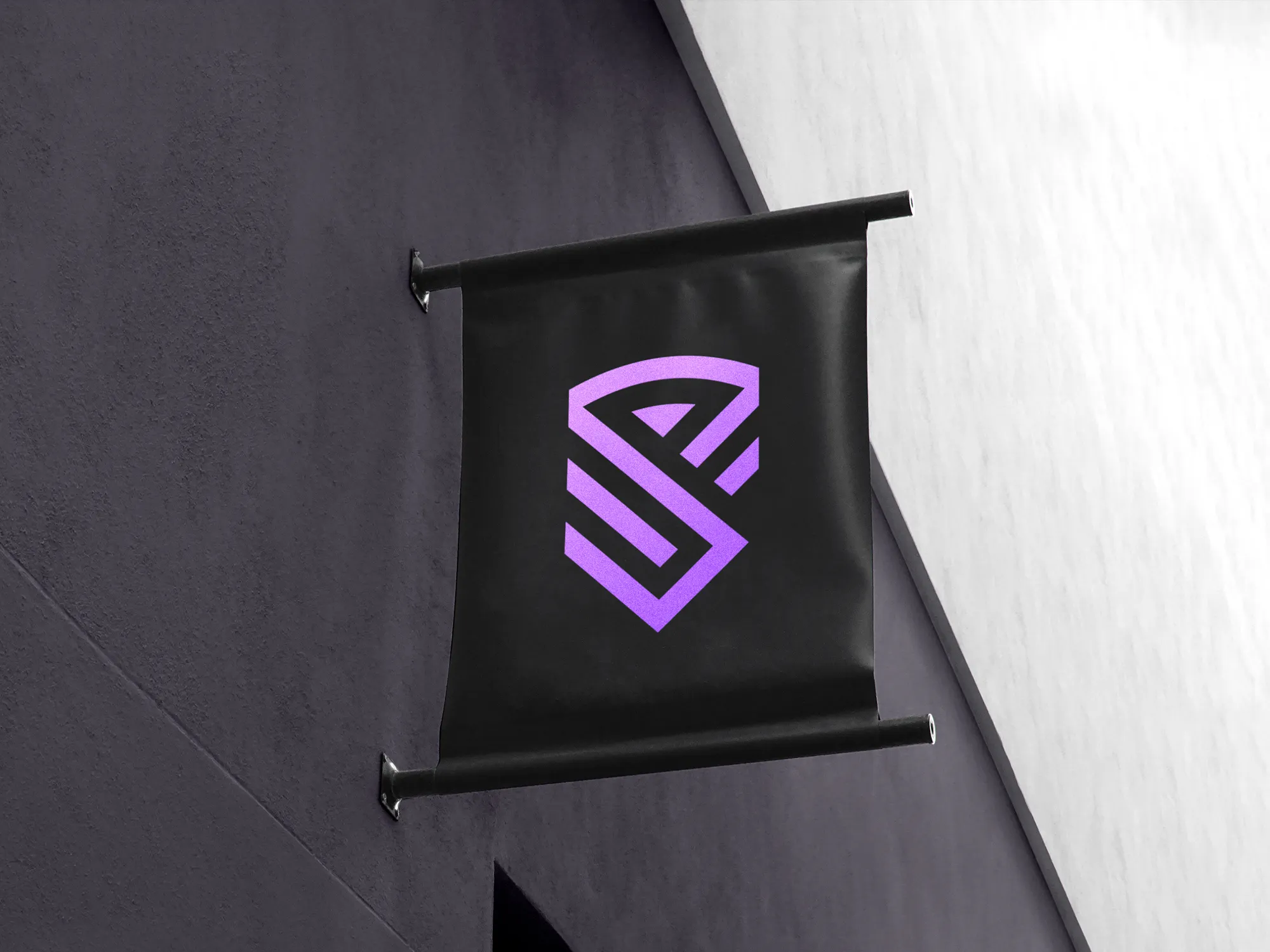
This logo was created for a consulting firm specializing in the energy and power grid sector. Aimed at an elite clientele, the design reflects strength, precision, and reliability.

Project scope:


  • Logo design
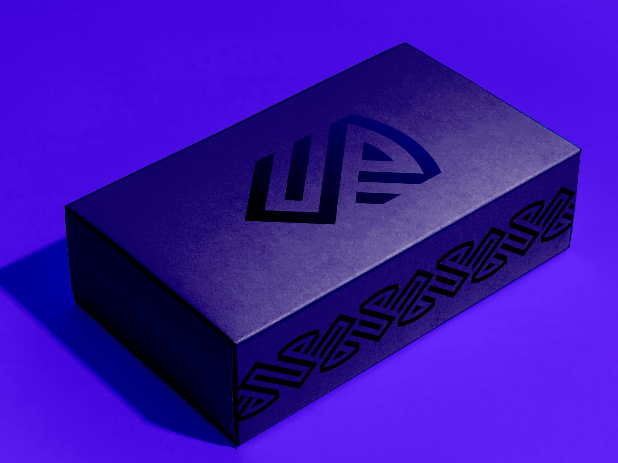
  • Visual identity
  • Print collateral

Objectives & requirements

The objective was to create a simple, clean, strong, and memorable design while honoring the founders’ Navy SEAL background. Subtle naval references and a bold color palette were used to reflect strength, discipline, and resilience. The result needed to feel distinctive and confident without becoming overly literal or militaristic.


Logo elements

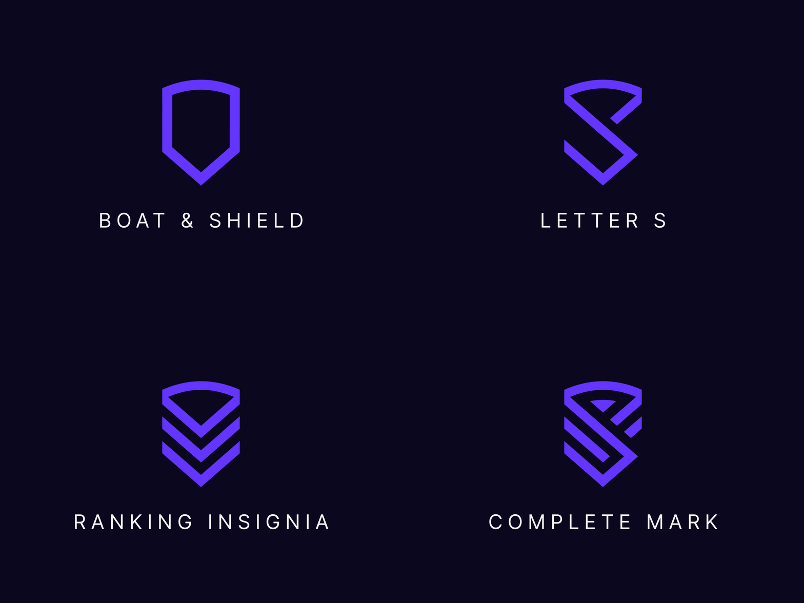
The symbol is designed to feel bold, clean, and powerful, with sharp geometric forms that communicate strength, discipline, and confidence. Subtle references to naval symbolism honor the founders’ Navy SEAL background without making the identity feel overly literal.


  1. Boat & Shield – a subtle reference to the Navy, while also suggesting protection and resilience.
  2. Letter S – integrated into the symbol as a reference to the company name.
  3. Rank Insignia – inspired by military insignia worn on uniforms, reinforcing the connection to service, discipline, and leadership.

Built to be remembered

The result is a sophisticated and authoritative visual identity that reflects the firm’s expertise, discipline, and commitment to excellence. Strong forms and subtle symbolic references create a distinctive presence while maintaining a polished, professional character.