EDIVA

Built Around Community, Education & Heritage


Ediva is a science fair organization that promotes science-related books and projects across a wide range of themes and topics. The organization creates opportunities for learning, discovery, and the exchange of scientific ideas.

Project scope:


  • Logo design
  • Logo animation
  • Print design
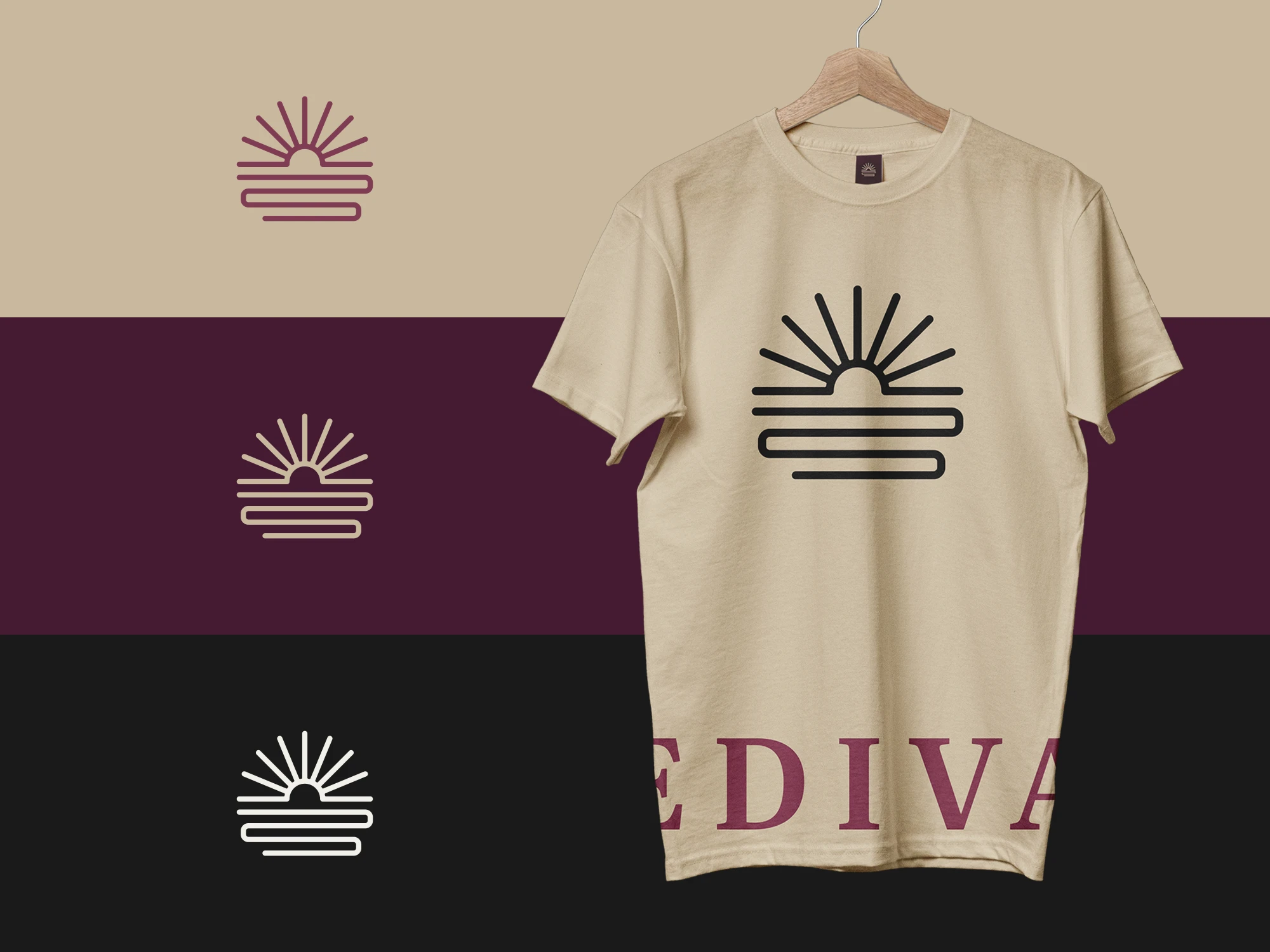
  • Merch design

Objectives & requirements

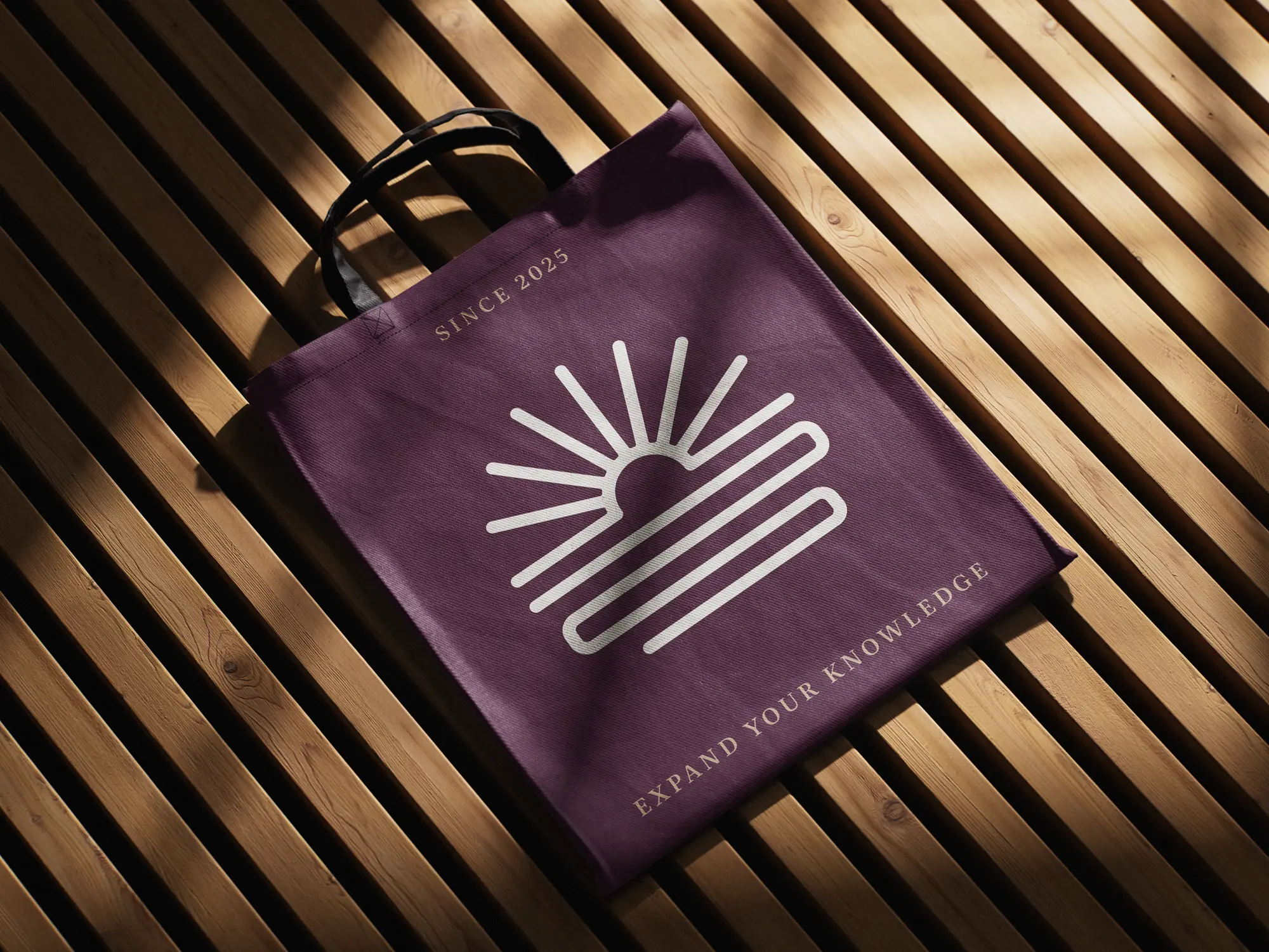
Since books are at the core of the organization’s work, the visual identity needed to place a strong emphasis on reading and printed knowledge rather than digital learning.
 
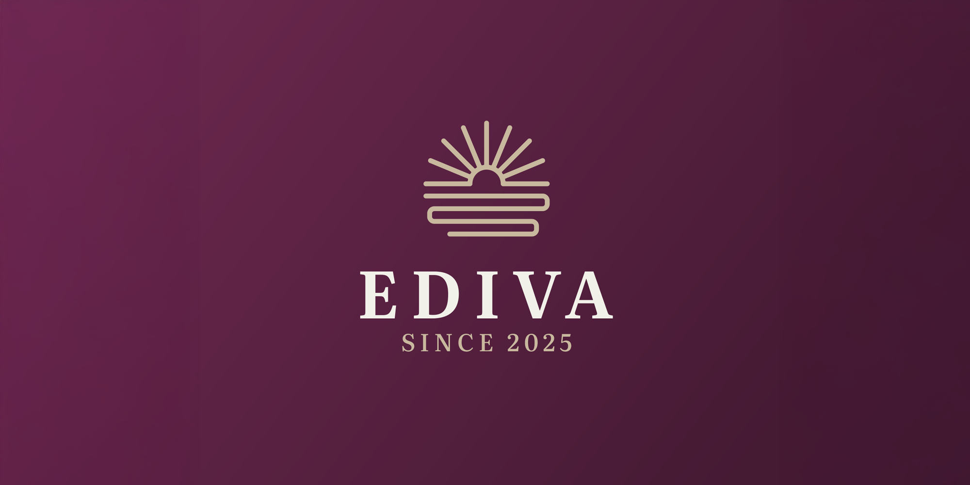
The logo concept also subtly incorporates elements inspired by the region where the science fair is held, known for its sunny climate and numerous rivers.

Visual direction & style

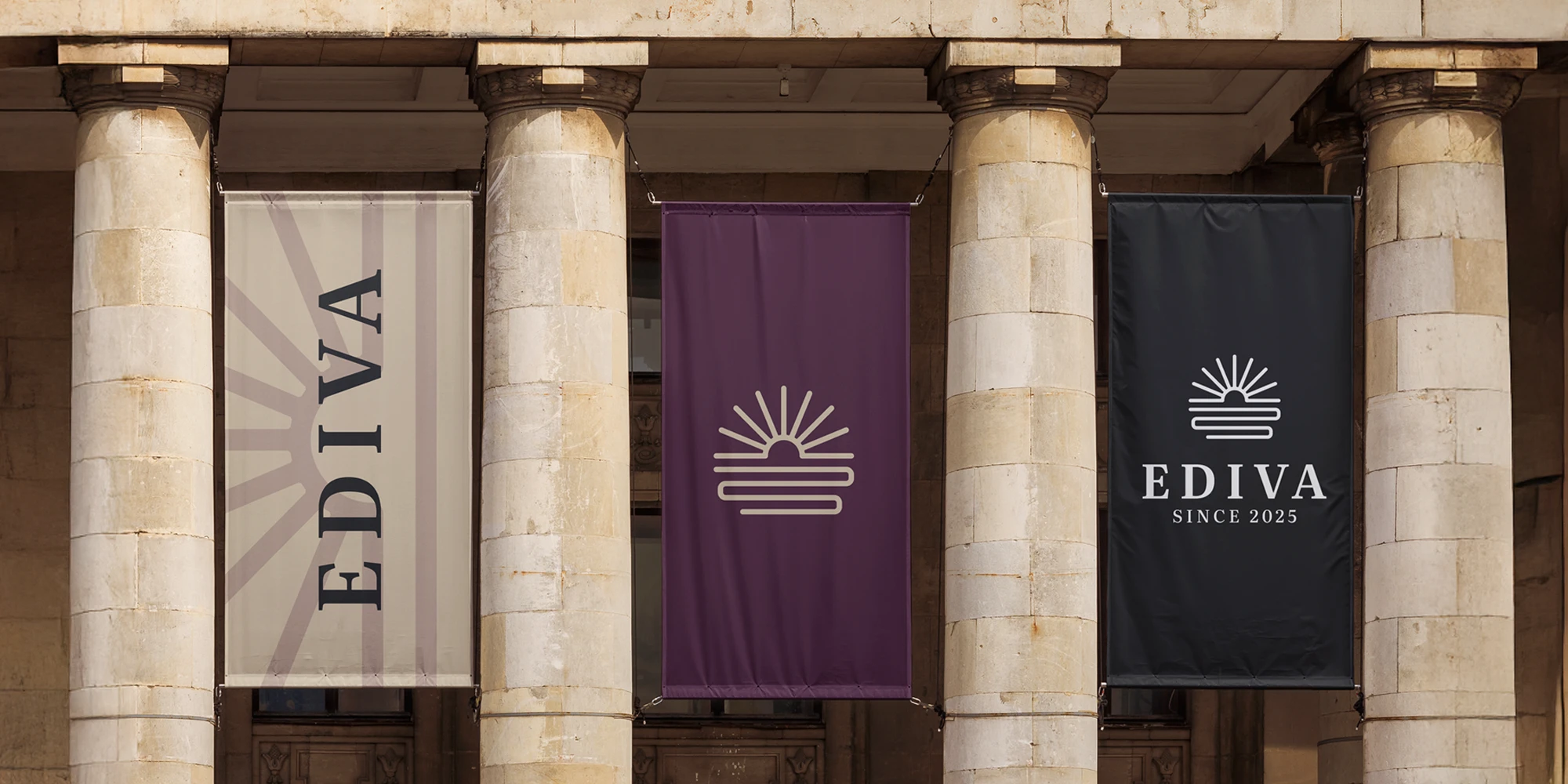
The visual direction was focused on creating a clean logo with a subtle traditional character. The icon takes a modern, minimal approach, communicating the organization’s concept in a simple and clever way, while the typeface introduces a sense of tradition associated with books, libraries, museums, and academic institutions.


Creativity lives in small details

The final identity brings together science, books, and the character of the region in one clear and memorable system. A modern symbol paired with a more traditional typeface creates a balanced look that feels both contemporary and rooted in knowledge, education, and discovery.